How to Reduce Colors in an SVG Without Breaking the Artwork
Reduce an SVG palette by visual role, not an arbitrary number. Merge near-colors while preserving contrast, negative space, cut layers, and operation colors.
On this page
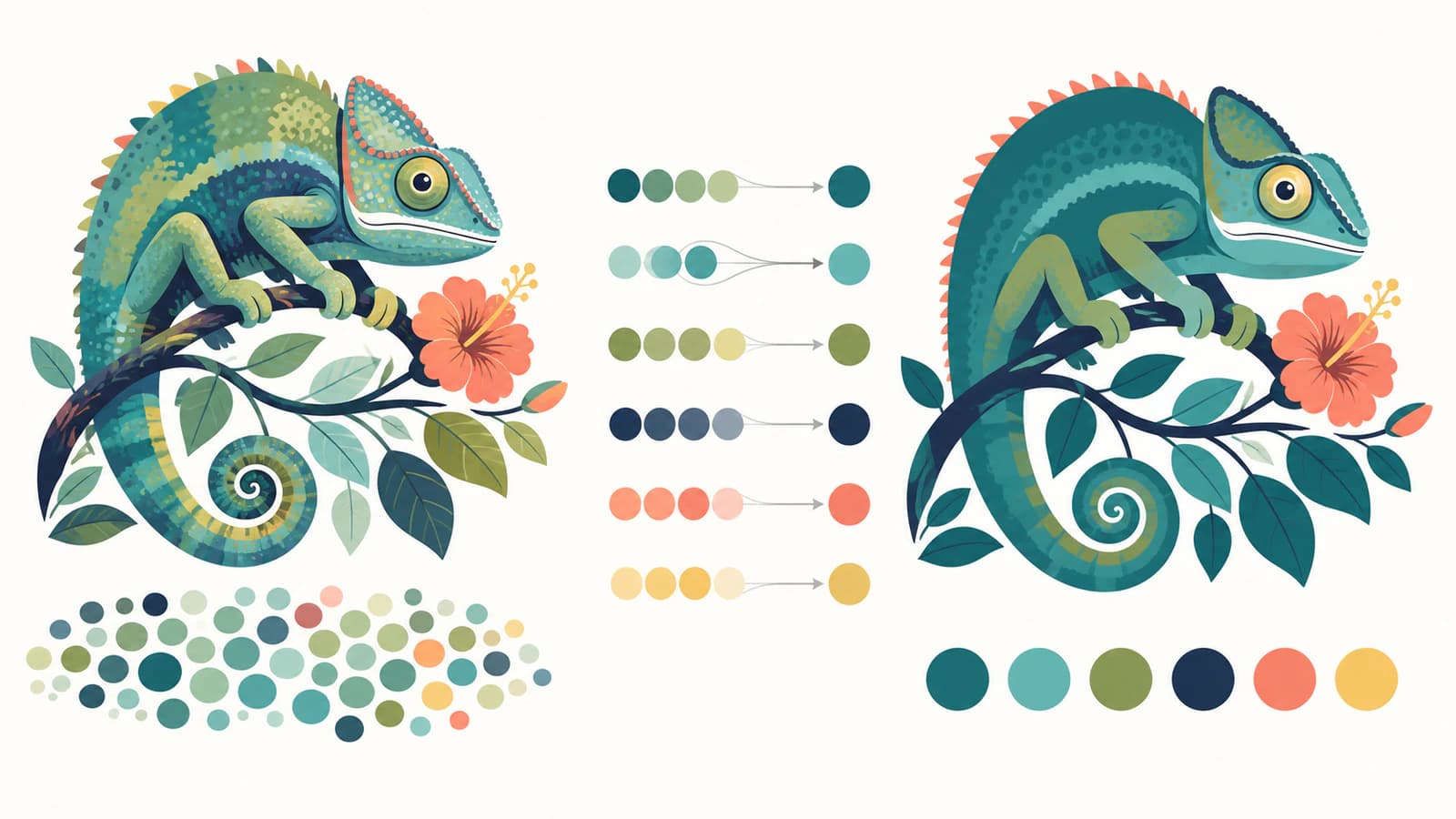
To reduce colors in an SVG safely, group colors by what they do in the artwork, then merge near-duplicates within each group. Keep separate any colors that carry different meanings, such as highlights versus shadows, foreground versus background, or cut versus score operations.
The common mistake is choosing a target such as "four colors" and letting a clustering tool decide everything. That can be a useful first pass, but the final palette needs a visual and production review. Two blues that look almost identical may be safe to merge. Two equally similar grays may be the only contrast separating an eye from a face.
A safe palette-reduction pass
- Save an untouched copy.
- Inventory fills, strokes, gradients, and opacity.
- Name colors by role before changing hex values.
- Merge near-colors one role at a time.
- Check contrast, holes, and small details at final size.
- For Cricut or production files, confirm that operation colors and layers still mean the same thing.
Recoloring and reducing colors are different jobs
Recoloring replaces one value with another. If a blue logo becomes green but still uses the same number of fills, the palette size has not changed.
Color reduction collapses several values into fewer values. A trace may contain #173f75, #184076, and #194177 because anti-aliased pixels became separate regions. Mapping all three to one blue reduces both the palette and, after geometry cleanup, the number of fragments you need to manage.
| Job | Before | After |
|---|---|---|
| Recolor | Three blues | Three greens |
| Palette reduction | Three nearly identical blues | One blue |
| Layer reduction | Several same-role shapes or layers | One production layer where geometry allows |
These can happen together, but they are not interchangeable. The guide to changing SVG colors covers direct color replacement. This article focuses on deciding which colors can become one.
Once the intended palette is final, the same-artboard color-separation workflow exports one aligned file per exact color without undoing those palette decisions.
First, find the colors the file actually uses
Open the SVG in a vector editor that can list document colors or select objects by fill. Illustrator, for example, documents selecting objects with the same fill and stroke. For a simple file, a text editor also reveals explicit fill and stroke values.
Count more than hex codes:
- Solid fills on shapes
- Stroke colors on outlines
- Gradient stops
- Opacity that makes one color appear lighter over a background
- Styles stored in classes rather than directly on shapes
- Embedded raster images, whose pixel colors are not an SVG palette
Ten listed hex values do not always mean ten visible colors. The same hex at different opacity can look different. A gradient may contain only two stops but render many intermediate tones. A raster <image> can show thousands of colors while the surrounding SVG has one fill. The SVG painting specification distinguishes solid colors, gradients, patterns, fill and stroke opacity, and other paint behavior.
If the file contains a raster wrapper instead of editable shapes, color reduction belongs before or during a new trace. The pixelated-SVG check will tell you whether there are real paths to edit.
Name colors by role
Before changing values, make a small palette map:
| Role | Current colors | Keep separate? |
|---|---|---|
| Main silhouette | Dark navy, near-navy | Usually merge |
| Highlight | Pale blue | Keep if it defines form |
| Outline | Black | Keep if the edge is intentional |
| Background | White rectangle | Remove if transparency is intended |
| Cut operation | Red | Keep separate from score or engrave |
This prevents automatic similarity from making the wrong decision. Color distance is useful, but context wins. A small highlight beside a dark shape may need less numerical separation than two large background regions, yet contribute more to legibility.
Map the near-colors to their jobs before choosing survivors. A background tint, main fill, outline, and focal accent may be numerically close to other swatches, but each has a different reason to remain distinct.
For cut files, role can be literal. In Cricut Design Space, imported SVGs retain separate layers and the Operation control assigns behaviors such as Basic Cut, Draw, Score, and Engrave to selected layers. In other laser or CNC workflows, colors may also be used to organize operations. Do not merge operation-bearing layers merely because their colors look close on screen.
Merge near-colors in a vector editor
Work from the least risky pair to the most visible one.
- Duplicate the file or artboard.
- Select one candidate color with Select Same Fill or the editor's equivalent.
- Temporarily replace it with the neighboring palette color.
- Inspect small features, intersections, and negative space at normal viewing size.
- Toggle between the original and reduced copies.
- Keep the merge only if the shape hierarchy and production meaning survive.
- Repeat with the next pair.
After colors match, adjacent shapes do not automatically become one path. Unite them only when they should be one editable or cut shape. Two objects can share a fill while remaining separate for animation, layout, or editing.
If you are collapsing the whole logo to one ink, matching fills may hide an essential interior symbol. See how to prepare a one-color logo with deliberate negative space before accepting that variant.
This is also where node and fragment quality matter. If one visual blue is split across hundreds of slivers, selecting by fill helps, but the file may still be hard to edit. A cleaner trace can be faster than repairing every fragment.
What automatic clustering can and cannot do
Palette tools often cluster colors by numerical distance. K-means and similar methods can turn a long list of close values into a chosen number of representative colors. That is useful for illustrations created from noisy raster sources.
Automatic clustering does not know:
- which feature is a face, letter, hole, or outline;
- which colors indicate machine operations;
- whether a tiny accent carries brand meaning;
- whether transparency over a background created the apparent color;
- whether two shapes must remain independently editable.
Use the result as a draft. Compare it at final output size, not only while zoomed in. A merge that seems harmless at 800% can erase a small eye or counter at sticker size.
When rasterize and retrace is reasonable
Exporting the SVG to PNG, reducing the raster palette, and tracing it again is a destructive reset. It flattens groups, names, reusable symbols, text structure, and carefully placed paths into pixels before rebuilding them.
Use that route only when the current SVG structure is already unusable and you have no cleaner source. It can help with a badly fragmented auto-trace whose only useful property is its appearance. Keep the existing SVG as reference, export a large raster with transparency, reduce colors deliberately, then retrace and inspect the new paths.
Do not rasterize a clean, organized SVG just to change four fills. Direct vector editing preserves far more information.
Verify the reduced file
Run these checks before saving over anything:
- View on both light and dark backgrounds.
- Check silhouettes and negative spaces.
- Confirm outlines did not disappear into fills.
- Inspect gradients and opacity separately from solid colors.
- Count the final Cricut layers or production operations.
- Look at small text and icons at their real output size.
- Open the exported SVG fresh in another viewer.
If the file is for Cricut, the layered SVG workflow explains how color maps to material and assembly. The hard-to-weed guide covers the geometry problems that fewer colors alone cannot solve.
Where PerfectVector fits
PerfectVector does not edit an existing SVG. It helps when the color explosion began with a raster image. The SVG for Cricut workflow converts the source into editable paths and lets you inspect and adjust the traced color regions before download.
Use that route when a PNG or JPG produced dozens of near-colors and fragmented layers in another converter. Start from the cleanest raster you have, remove unwanted shadows or background variation, then compare the vector preview. Merge colors according to the material layers you actually plan to cut.
The goal is not always the fewest possible colors. It is the smallest palette that still communicates the design and the production plan.
FAQ
How do I reduce the number of colors in an SVG? List the file's fills, strokes, gradients, and opacity, group them by visual or production role, then merge near-duplicates one pair at a time. Use select-by-fill in a vector editor and compare against an untouched copy after every merge.
Does changing two fills to the same hex merge the SVG layers? Not necessarily. The shapes now share a color, but they remain separate objects until you unite or combine their geometry. Keeping them separate may be useful for editing, animation, or layout even when they cut from the same material.
Can I automatically limit an SVG to four colors? Palette-clustering tools can produce a four-color draft, but they do not understand semantic details or production operations. Review small features, contrast, holes, gradients, and layer meaning before using the result.
Why did tracing a four-color image create dozens of colors? The raster probably contained anti-aliasing, shadows, compression variation, or softened edges. A tracer treated those pixel differences as separate regions. Clean the raster selectively or merge near-colors in the vector result.
Should I reduce SVG colors before uploading to Cricut? Usually yes when several colors are unintended near-duplicates. Plan one meaningful color per material or layer, preserve anything that should cut separately, and verify the layer count after import. Fewer deliberate layers are easier to cut and assemble than a trace full of tiny color variations.
Sources
- W3C — SVG 2 Painting — Defines fills, strokes, gradients, patterns, and paint opacity.
- Adobe Illustrator — Select objects with the same fill and stroke — Documents a practical select-by-appearance workflow.
- Cricut — Upload images into Design Space — Explains how SVG layers are retained on upload.
- Cricut — Selecting Operation — Defines machine operations assigned to Design Space layers.
If the palette problem started with a raster image, prepare it for Cricut and inspect the traced colors. Keep the original beside the preview and approve each merge based on the finished material, not only the screen.
More from the blog
Inkscape Group by Color: Keep Paths or Merge Them?
Select matching fills in Inkscape, choose Group or Union, and check overlapping colors before merging. Keep editable paths or export aligned color files safely.
How to Check an SVG File Before You Cut It (or Buy It)
The five-minute preflight for cut files: spot fake vectors, doubled paths, node bloat, and stray boxes before you waste vinyl, plus what to check before buying.