Vectorize Hand Lettering Without Losing Its Shape
Turn hand lettering into a clean SVG while keeping open counters, expressive terminals, intentional texture, and curves that remain easy to edit.
On this page
To vectorize hand lettering well, trace the shapes you meant to draw, not every pixel the camera recorded. Start with a clean, high-contrast scan, decide how much ink texture should survive, then inspect the counters, terminals, stroke joins, and node count before you export the SVG.
That last inspection is what separates a usable lettering file from a technically valid trace. A converter can produce an SVG in seconds and still close the hole in an e, merge two nearby strokes, or turn a lively brush ending into a blunt wedge.
The short version
- Use auto-trace when the lettering is bold, high contrast, and already close to the shape you want.
- Redraw by hand when the source is tiny, badly photographed, or meant to become a permanent logo or type system.
- Preserve important irregularities, but remove scan noise and accidental bumps.
- Check counters, terminals, joins, and anchor points at both high zoom and final output size.
First decide what must stay
Hand lettering is not the same as typed text. Its value often lives in the uneven baseline, the way one stroke leans into the next, or the dry-brush edge at the end of a letter. Cleaning everything can make the result look generic. Preserving everything can leave you with a heavy SVG full of dust and wobble.
Before tracing, mark the features that make this piece itself:
- Counters: the enclosed or partly enclosed spaces inside letters such as a, e, g, and o.
- Terminals: the ends of strokes. A sharp flick, round cap, or dry-brush finish can carry much of the style.
- Stroke joins: places where a script stroke crosses or meets another stroke.
- Texture: deliberate ink grain, bristle gaps, or rough edges that should remain visible.
- Rhythm: spacing, slant, and baseline changes across the word.
Everything else is a candidate for cleanup. Paper grain, compression blocks, dust, and shadows are capture problems, not lettering features. If an individual letter will become a font glyph, continue with the FontForge SVG import workflow to set its baseline, contours, and spacing.
Auto-trace or redraw?
Both routes can produce a real vector. The right choice depends on the source and how long the file needs to last.
| Situation | Better route | Reason |
|---|---|---|
| Bold black lettering on clean white paper | Auto-trace | The boundaries are clear and need little interpretation |
| Brush lettering with intentional dry texture | Auto-trace, then selective cleanup | A full redraw can erase the texture that gives the mark its character |
| Small phone photo with shadows or blur | Recapture first, then trace | Neither tracing nor redrawing should begin from avoidable distortion |
| Lettering becoming a primary brand logo | Manual redraw or careful trace cleanup | The file will be reused enough to justify precise geometry |
| A one-off print, sticker, or social graphic | Auto-trace | A clean result matters more than constructing a reusable letter system |
| Plotter or single-line engraving job | Centerline workflow | A normal outline trace follows both edges of each ink stroke |
The final row is easy to miss. Most image vectorizers create filled outlines around the ink. That is correct for print, web, vinyl shapes, and many engraving fills. A pen plotter or single-line engraver needs a path down the middle instead. Inkscape's current tracing guide documents a dedicated centerline mode for handwriting and line drawings; the distinction is covered in more detail in our line art tracing guide and signature SVG guide.
Prepare the lettering for a cleaner trace
- Capture it square to the page. Scan at a useful resolution, or photograph it in even daylight with the camera directly above the paper. Perspective distortion changes the letterforms before tracing begins.
- Crop away the desk and page edges. Give the converter only the artwork it needs to interpret.
- Set the black and white points. The paper should be clean white and the main ink should be confidently dark. Do not push contrast so far that thin entry strokes disappear.
- Remove isolated dirt, not intentional texture. Zoom in and compare each speck with the direction of the brush. Random dots usually go; repeated bristle marks may belong.
- Repair accidental gaps. Close a break caused by a dry pen or bad photo when the original stroke was clearly meant to be continuous.
- Keep a copy of the untouched scan. The raster master is your reference when cleanup starts changing the drawing.
If you drew digitally, export a large PNG on a plain or transparent background. Avoid a low-quality JPG. Its compression blocks can become tiny shapes around every edge.
Vectorize, then audit the letterforms
PerfectVector fits the auto-trace route when you have a prepared scan and want an editable SVG to audit before doing manual cleanup. Upload the lettering, generate the SVG, and inspect the result before treating it as finished.
Start with the counters. Every interior opening that matters should remain open. Small counters are usually the first parts to close when a trace smooths too aggressively or joins nearby edges.
Next, inspect the terminals and joins. A terminal should end with the same energy as the source, not with a random bump. At crossings, look for accidental bridges, pinched corners, and thin white gaps. These defects often disappear when you zoom out, then reappear in print or cutting.
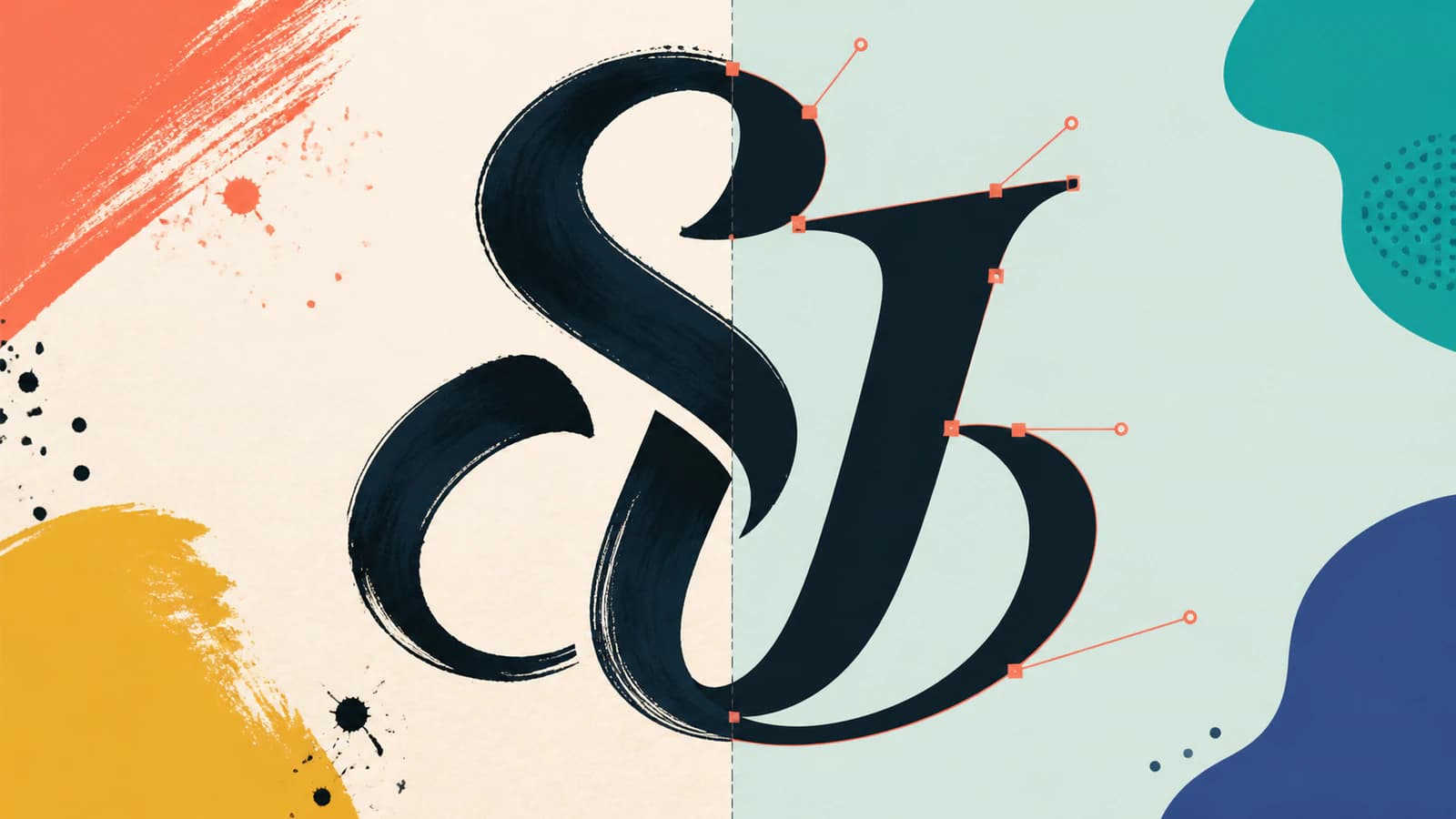
Finally, reveal the anchor points in your vector editor. More nodes do not mean a more faithful result. A dense chain of points around a simple curve is harder to edit; Adobe's current trace-editing guide specifically recommends its Simplify command for excess anchor points. Our guide to SVGs with too many nodes shows how to make that decision without erasing the lettering's character.
How much texture should you keep?
There is no universal clean setting. Decide from the destination.
For a screen print, poster, or large label, some edge texture can make the vector feel like the original ink. Keep the larger gaps and bristle marks, but remove fragments too small to reproduce reliably.
For vinyl cutting, laser cutting, or a small stamp, simplify more. Every notch becomes tool movement, every loose speck becomes a separate shape, and tiny interior islands may be difficult to weed or manufacture. Test at the final physical size, not only at 800 percent zoom.
For a logo, save two versions if texture is important: a character-rich primary mark and a simplified small-size mark. The small version is not a worse trace. It is a deliberate optical adjustment for places where fine detail cannot survive.
Common failures and the fix for each
A counter closed up. Return to the source and increase separation around that opening, or edit the vector with a small cutout shape. Do not keep reducing the whole trace just to rescue one letter.
Two strokes merged. Check whether the original strokes actually touch. If they do not, clean the source gap before retracing. If they do, decide whether the overlap should become one silhouette or remain as layered shapes.
The edge looks like melted plastic. The trace removed too much character. Restore selected texture from the source or reduce smoothing. You want intentional irregularity, not uniform roughness everywhere.
The curves look nervous. Too many nodes are trying to follow pixel noise. Simplify the path in small passes and compare it against the scan after each pass.
The SVG has a white box. The paper was traced as a background shape. Delete that shape and inspect the lettering on both a light and dark canvas. The same check prevents the hidden background problem.
A practical final check
Open the SVG in the program where you will actually use it. Check each of these before delivery:
- All counters that should be open are open.
- Thin entry and exit strokes have not disappeared.
- Stroke joins look intentional at normal reading size.
- Terminals still resemble the original hand.
- Texture is large enough to reproduce and small noise is gone.
- Simple curves use a restrained number of anchor points.
- The background is transparent when required.
- The file works at its final print, cut, or screen size.
Once those checks pass, save the editable SVG and a raster preview together. The SVG is the production master; the preview makes it easy for clients, printers, and future you to see what the file should look like without opening a vector editor.
For a rubber stamp, use the rubber stamp artwork workflow to turn a clean scan into editable shapes, then check the counters and thin strokes at the intended imprint size. If the lettering is for a wax seal, use the wax seal artwork workflow and confirm the final-size artwork with the maker before ordering. Neither conversion produces the stamp or seal die.
If the lettering will become a pottery mark, prepare it for the stamp artwork workflow and inspect counters at the intended size.
Sources
- Adobe Illustrator — Image Trace panel options — threshold, paths, corners, noise, fills, strokes, and transparency controls.
- Adobe Illustrator — Edit Image Trace results — expanding traces into editable paths and simplifying excess anchors.
- Inkscape Beginners' Guide — Tracing an image — outline and centerline tracing behavior for handwriting and line drawings.
- W3C — SVG Paths — open and closed path geometry, subpaths, curves, and endpoints.
Have a lettering scan ready? Run it through PerfectVector, then inspect the counters, terminals, stroke joins, and anchor points before choosing auto-trace over a careful redraw.
More from the blog

Vectorize a Hand-Drawn Map Without Losing Character
Turn a hand-drawn map into editable vector paths while preserving line wobble, lettering, hierarchy, and texture—without pretending the result is GIS data.
Turn a Child's Drawing Into an SVG (Wobble and All)
Turn your kid's drawing into an SVG for shirts, ornaments, and cards: photograph it right, handle crayon and marker, and keep the wobble that makes it theirs.