Vectorize a Hand-Drawn Map Without Losing Character
Turn a hand-drawn map into editable vector paths while preserving line wobble, lettering, hierarchy, and texture—without pretending the result is GIS data.
On this page
- Decide what kind of map you are making
- Make a fidelity budget
- Capture the paper without adding new distortion
- Clean the raster, but keep a character reference
- Choose the right vector representation for each feature
- Land, water, and filled regions
- Roads, rivers, paths, and borders
- Labels and hand lettering
- Landmarks and repeated symbols
- Hatching, stipple, and paper texture
- Convert suitable artwork, then edit by role
- Organize the vector like a map
- Preserve wobble selectively
- Check meaning, not just path quality
- Export for the destination
- Common vector-map failures
- FAQ
- Sources
To vectorize a hand-drawn map without sanding away its personality, decide which marks must stay faithful before you trace anything. Capture the page evenly, separate geographic structure from decorative ink, use automatic vectorization for strong filled regions, and redraw centerlines, labels, and critical symbols deliberately. Preserve selected irregularities—do not preserve every paper fiber and camera shadow.
The result can be a scalable illustrated map with editable colors and shapes. It is not automatically GIS data, a survey, or an accurate navigation product. Vector paths preserve visible drawing; they do not recover coordinates, projections, street databases, or measurements that were never in the artwork.
If an illustrated pictogram will become a point symbol in an existing GIS project, prepare a custom SVG marker for QGIS with a separate parameterized copy and clearly assigned paint regions.
The character-preserving workflow
- Define the map's purpose and accuracy requirements.
- List the handmade features that give it character.
- Photograph or scan the paper flat with even light.
- Clean the capture without erasing intentional texture.
- Trace filled regions; redraw roads, rivers, labels, and key symbols as needed.
- Organize the vector by visual role and test it at final size.
Decide what kind of map you are making
“Hand-drawn map” can describe very different jobs:
| Intended result | Main priority | Appropriate vector goal |
|---|---|---|
| Wedding, event, or visitor map | Recognition and charm | Editable illustrated landmarks, routes, labels, and color |
| Fantasy or story map | World-building and style | Coastlines, symbols, lettering, terrain motifs, and texture |
| Memory or community map | Personal meaning | Preserve chosen omissions, emphasis, and handwritten details |
| Educational diagram | Clear hierarchy | Simplified regions, arrows, labels, and symbols |
| Navigation or property document | Measured accuracy | Rebuild from authoritative spatial data; use the drawing as reference only |
The University of California, Davis Hand Drawn Maps workshop treats mapping as both communication and self-expression. That framing matters here. A handmade map may enlarge an important place, bend a road for clarity, omit an unhelpful block, or place a landmark where the composition needs it. Those choices are not necessarily errors.
Before tracing, write a one-sentence brief: “Preserve the artist's coastlines, lettering, landmark icons, and uneven hatching; clean scanner dust and rebuild the route as an editable stroke.” That sentence becomes your editing rule.
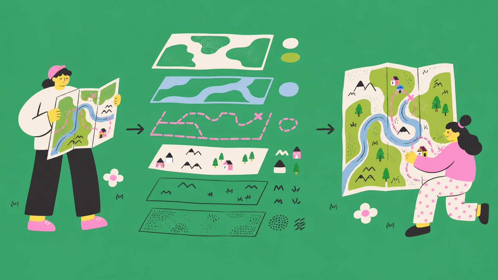
For a wedding or event map, reuse the illustrated artwork across stationery, keeping labels and final layout in your design tool.
Make a fidelity budget
A vector cleanup is a series of tradeoffs. A fidelity budget states where you will spend time preserving irregularity and where you will simplify.
Mark each feature as one of three types:
- Preserve closely: a distinctive coastline, hand-lettered title, compass rose, signature building, or characterful border.
- Preserve in spirit: tree clusters, mountain hatching, wave marks, stipple, or decorative paths that can be reduced without changing the voice.
- Rebuild cleanly: route centerlines, legend boxes, arrows, repeated dots, scale indicators, and geometry that must remain easy to edit.
This keeps “hand-drawn” from becoming an excuse for uncontrolled node counts. It also prevents a well-meaning cleanup from replacing every expressive line with a perfect geometric curve.
Cartographer Tom Woolley describes planning, hierarchy, label placement, and grids as part of the drawing process in Making Maps: Planning and Pencil. Your vector should preserve those compositional decisions even when the individual paths are cleaned.
Capture the paper without adding new distortion
A flatbed scanner gives consistent focus for paper that can safely lie flat. For a bound sketchbook, fragile sheet, or large map, photograph from directly above.
Use this capture checklist:
- Place the page on a flat support.
- Keep the camera sensor parallel to the paper.
- Light from both sides to reduce shadows and paper texture.
- Include the whole neatline or page edge so rotation is visible.
- Shoot at the highest practical resolution without digital zoom.
- Make a second exposure if faint pencil and dark ink cannot both be captured well.
- Keep the untouched master before cropping or contrast edits.
If the map's real-world size matters, include a ruler or reference square in the same plane. That preserves page scale, not geographic accuracy. A charming hand-drawn route may never have followed a formal map projection.
Correct four-corner perspective before tracing. Do not independently stretch width and height just to make one border look rectangular; that can alter every relationship inside it.
Clean the raster, but keep a character reference
Duplicate the capture. One copy remains the visual reference; the other becomes the trace-ready raster.
On the trace copy:
- neutralize uneven paper tone;
- remove dust, staple shadows, and page-edge clutter;
- increase line contrast gently;
- repair only accidental breaks;
- separate color regions when the paper and ink have similar values;
- crop to the artwork while retaining any required border.
Do not erase all texture by default. Pencil grain, broken dry-brush edges, and uneven ink may be central to the illustration. Keep a small reference panel of the original beside your vector document so cleanup decisions are compared with the art, not with an abstract idea of perfection.
When the map combines faint pencil, dark ink, and watercolor, create separate raster preparations for each visual family. One threshold setting rarely understands all three.
Choose the right vector representation for each feature
A map contains fills, outlines, centerlines, text, and repeated motifs. Treating them all with one trace method creates a tangled file.
Land, water, and filled regions
Closed filled shapes work well for continents, parks, lakes, districts, and bold icon silhouettes. Automatic vectorization can provide a strong start when their boundaries are distinct.
Preserve the large-scale rhythm of a coastline without following every pixel nick. Compare important bays, peninsulas, and islands, then simplify only the segments that remain visually equivalent.
Roads, rivers, paths, and borders
A drawn line can become either:
- a stroked centerline, easy to edit for width and style; or
- a filled outline with two edges, closer to the literal ink footprint.
Choose intentionally. A route that must be recolored or extended is usually easier as a centerline. A broad brush river whose edge character matters may be better as a filled shape.
Do not accept a doubled trace just because it resembles the source at normal zoom. Select it and decide whether the two boundaries are meaningful.
Labels and hand lettering
Ordinary place labels are often best retyped with a compatible licensed typeface. That keeps spelling editable and makes future language versions possible.
Signature lettering may deserve manual vector tracing. Trace the actual strokes or filled letter shapes, preserve counters, and compare spacing against the original. Do not run optical character recognition and assume it understood stylized handwriting.
Keep a hidden text note with the correct spelling of every outlined label. Once letters become paths, spell-checkers cannot help you.
Landmarks and repeated symbols
Manually refine signature icons such as a castle, venue, church, tree, mountain, or compass. Repeated generic motifs can become reusable symbols or components in the vector editor.
If every tree was drawn differently on purpose, do not replace them all with one clone. Build a small family of variants and reuse them with rotation and scale changes.
Hatching, stipple, and paper texture
Selective texture preserves the hand. Blanket texture often makes the SVG heavy.
Options include:
- keep a few representative hatch paths;
- build a small vector pattern for repeated marks;
- retain one clipped raster texture when the destination permits mixed media;
- simplify dense stipple into grouped dots at final output size.
If the deliverable must be pure vector, state that constraint early. It may require a more stylized texture treatment.
Convert suitable artwork, then edit by role
For a clear flat map, PerfectVector can convert the drawing into editable vector paths. It is most useful for strong coastlines, filled regions, bold icons, and other visible shapes that would be tedious to rebuild from scratch.
It does not identify roads as roads, infer a geographic projection, geocode labels, create GIS topology, or decide which wobble is intentional. Use the conversion as a first reconstruction. Then separate the result into geographic structure, labels, symbols, decoration, and texture.
If the map is mainly black ink, a monochrome result can be easier to audit than a many-color trace. If watercolor regions matter, keep enough color separation to edit them without turning every paper variation into a new shape.
Generative tools solve a different problem. Adobe's current Generate Vectors from Images documentation describes a generative workflow that can produce style variations from a reference image. That can be useful for exploring a new look, but it is not the right route when fidelity to the original artist's decisions is the goal.
Organize the vector like a map
A practical layer structure might be:
- background and paper field;
- land and water;
- region fills;
- roads, rivers, and routes;
- landmarks and symbols;
- labels and title;
- border, legend, and compass;
- decorative texture.
Keep clipping masks and compound paths as simple as the artwork allows. Use consistent spot or process colors when the map will be printed, and store color decisions in named swatches.
SVG paths can contain line and curve commands as well as open and closed subpaths, as defined by the W3C SVG Paths specification. That flexibility is why you should inspect structure: two files may look the same while one uses an editable stroked route and the other uses a dense filled outline.
Name important groups in the editable master. Even if another application ignores those names, the master remains understandable for future revisions.
Preserve wobble selectively
Zoom out to the final reading size before changing a curve. If the irregularity gives the line energy or makes a hand-lettered title recognizable, keep it. If it is invisible except at 800% and forces twenty extra nodes, simplify it.
A useful review method is the silhouette test:
- hide labels and texture;
- view the main land, water, and route shapes at thumbnail size;
- compare the visual balance with the original;
- restore signature symbols and lettering;
- compare again at final output size.
This separates meaningful character from microscopic capture noise. It also catches a common failure: a vector whose curves are individually smooth but whose overall proportions drifted during cleanup.
Check meaning, not just path quality
Map errors can be semantic. Run a content proof after the geometry proof.
Verify:
- every place name and title spelling;
- route start and end points;
- legend symbols and their matching features;
- north arrow and compass orientation, if used;
- important landmarks and relative order;
- borders and region colors;
- accessibility of label contrast and type size;
- credits, source notes, and permissions.
For an event map, ask someone unfamiliar with the artwork to find the destination. For a story map, ask whether the hierarchy matches the intended narrative. For anything used in navigation, compare against an authoritative map and label the illustration's limitations.
Do not copy proprietary base maps, icons, or another artist's work without rights. Vectorization changes the format, not ownership or license terms.
Export for the destination
Keep an editable master before outlining all type or flattening structure.
For web SVG:
- remove unused objects and metadata that are safe to remove;
- set an appropriate
viewBox; - test at phone and desktop sizes;
- include accessible surrounding HTML rather than relying on tiny labels inside the image.
For print PDF or EPS:
- use the printer's color, bleed, font, and export specification;
- proof the actual physical size;
- inspect thin lines, reversed labels, and dense texture;
- reopen the exported file.
For animation or interactive maps:
- keep regions and routes as separate named objects;
- simplify paths enough for responsive interaction;
- plan focus, labels, and non-pointer access in the implementation.
For GIS or measured cartography, rebuild from authoritative spatial data in mapping software. An illustrated vector may be placed on top as artwork, but it should not be mistaken for the data layer.
Common vector-map failures
| What you see | Likely cause | Fix |
|---|---|---|
| Map looks sterile | Every line was replaced with perfect geometry | Restore selected coast, lettering, and symbol irregularities |
| File has thousands of nodes | Paper grain and pixel edges were traced | Clean the raster and simplify by visual role |
| Roads are hard to edit | Thick ink became doubled filled outlines | Rebuild suitable routes as centerline strokes |
| Text cannot be corrected | Every label was traced as shapes | Retype ordinary labels; keep a spelling reference for signature lettering |
| Texture overwhelms the map | All stipple and paper tone became vectors | Keep representative texture or a permitted raster layer |
| Coastline changed shape | Simplification was applied without a silhouette check | Compare at thumbnail and final output sizes |
| Map appears accurate but is not | Illustration was mistaken for spatial data | Label limitations and rebuild measured work from authoritative data |
FAQ
Can I automatically vectorize a hand-drawn map? Yes, when the source has clear shapes and strong linework. Automatic conversion is a starting point; roads, rivers, labels, symbols, texture, and meaningful irregularities still need deliberate review.
How do I keep a vector map looking hand-drawn? List the features that carry the style, such as uneven coastlines, signature lettering, varied trees, and selected hatching. Preserve those closely while simplifying scanner noise and invisible pixel wobble.
Should map roads become outlines or centerlines? Use centerline strokes when routes need easy width, style, or endpoint edits. Use filled outlines when the literal brush or ink footprint is part of the art. Avoid accidental doubled paths.
Can a vectorized drawing become a GIS map? Not automatically. Vector graphics contain visual paths, not georeferenced coordinates, projections, topology, or authoritative spatial attributes. Rebuild measured work from a trusted geographic source.
Does PerfectVector preserve handwritten map labels? It can reconstruct visible letter shapes, but it does not understand spelling or keep them as live text. Retype ordinary labels, and manually check signature lettering preserved as outlines.
Sources
- UC Davis DataLab — Hand Drawn Maps — mapping as communication and self-expression, plus core visual elements.
- Manuscript Maps — Making Maps: Planning and Pencil — planning, hierarchy, label placement, grids, and expressive map composition.
- Adobe Illustrator — Generate Vectors from Images — official description of generative reference-image variation, contrasted with faithful reconstruction.
- W3C — SVG Paths — lines, curves, open subpaths, and closed paths in the SVG standard.
Have a clean scan or photo of your illustrated map? Convert it into editable vector paths, preserve the features on your fidelity list, and rebuild the labels and routes that need semantic control.
More from the blog
Line Art to SVG: Get a Clean Trace Without Double Lines
Clean line art is the best image you can hand a vectorizer. Here's how to turn drawings and coloring pages into crisp SVGs, and dodge the double-line trap.
Coloring Page Line Thickness: Check the Printed Size
Choose coloring-page line thickness at the final size. Compare stroke weights, preserve small coloring spaces, and check whether your SVG uses strokes or fills.