
Responsive SVG Logos: Switch the Lockup at Small Sizes
Choose a detailed or compact SVG logo with picture media conditions. Test the selected source at three viewport widths, and separate art direction from scaling.
On this page
A responsive SVG logo can switch between a detailed lockup and a compact mark instead of shrinking every part together. Author the two compositions first, then use a <picture> source with a media condition to choose between them. Check the image's currentSrc at the widths you intend to support.
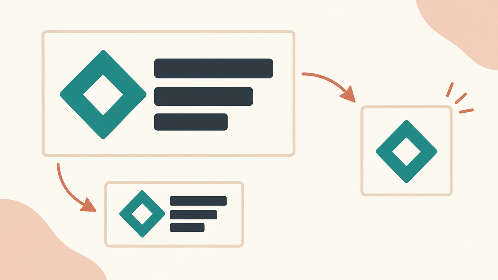
This example uses an original fictional Cove lockup: a hollow diamond with drawn lettering, plus a mark-only version. Its switch depends on the document viewport width. A narrow container inside a wide page does not trigger the same switch.
Scaling and art direction solve different jobs
Ordinary scaling preserves the whole composition: symbol, lettering and their spacing all get smaller together. Art direction selects another authored composition. Removing lettering or rearranging a mark is a design decision; an SVG file does not automatically make that decision because it is scalable.
The HTML picture reference describes alternative sources selected through media conditions and the img fallback. Here we offer a compact SVG at 599 pixels or narrower and a detailed SVG otherwise. The image frame stays the same size while its contents change.
Make two editable files
Save this original detailed lockup as detailed.svg. The letters are drawn paths, so this small example needs no font file:
<svg xmlns="http://www.w3.org/2000/svg" width="300" height="96" viewBox="0 0 300 96">
  <g fill="#176b5b" fill-rule="evenodd">
    <path d="M48 8 L88 48 L48 88 L8 48 Z M48 30 L66 48 L48 66 L30 48 Z"/>
    <path d="M130 24 H160 V32 H138 V64 H160 V72 H130 Z"/>
    <path d="M168 24 H198 V72 H168 Z M176 32 V64 H190 V32 Z"/>
    <path d="M206 24 H214 L225 60 L236 24 H244 L229 72 H221 Z"/>
    <path d="M252 24 H282 V32 H260 V43 H278 V51 H260 V64 H282 V72 H252 Z"/>
  </g>
</svg>
Save the compact version as compact.svg:
<svg xmlns="http://www.w3.org/2000/svg" width="96" height="96" viewBox="0 0 96 96">
  <path d="M48 8 L88 48 L48 88 L8 48 Z M48 30 L66 48 L48 66 L30 48 Z" fill="#176b5b" fill-rule="evenodd"/>
</svg>
The diamond path is identical in both files. The detailed file contains five paths; the compact file contains one. Neither includes an image element or live text. The two viewBox widths differ because their compositions differ, rather than because one file has been uniformly scaled.
Keep both source versions. For your own brand, decide which features must remain recognizable in the compact composition, then inspect its opening, margins and proportions. Our logo file format guide covers the broader source-and-delivery package; this example adds a browser choice between two approved versions.
Run the complete picture starter
Save this as starter.html beside the two SVGs and serve that folder locally. With Python installed, python3 -m http.server 8766 is one option; then open http://localhost:8766/starter.html in a browser.
<!doctype html>
<html lang="en">
<meta charset="utf-8">
<meta name="viewport" content="width=device-width, initial-scale=1">
<title>Cove logo source selection</title>
<style>
  body { margin: 24px; font: 16px system-ui; background: #f6f2e8; }
  .slot { width: 200px; border: 1px dashed #b9c8be; margin-bottom: 24px; }
  .narrow { width: 120px; }
  .slot img { display: block; width: 100%; height: 80px; object-fit: contain; }
  pre { white-space: pre-wrap; font-size: 12px; }
</style>
<h1>Cove: choose the composition</h1>
<p>Art-directed image, constant 200-pixel container:</p>
<div class="slot">
  <picture>
    <source media="(max-width: 599px)" srcset="compact.svg" type="image/svg+xml">
    <img id="directed" src="detailed.svg" width="300" height="96" alt="Cove">
  </picture>
</div>
<p>Ordinary scaling, same container:</p>
<div class="slot">
  <img id="scaled" src="detailed.svg" width="300" height="96" alt="Cove">
</div>
<p>Art direction in a narrower 120-pixel container:</p>
<div class="slot narrow">
  <picture>
    <source media="(max-width: 599px)" srcset="compact.svg" type="image/svg+xml">
    <img id="narrow" src="detailed.svg" width="300" height="96" alt="Cove">
  </picture>
</div>
<pre id="report"></pre>
<script>
  const images = [...document.images];
  function report() {
    document.getElementById('report').textContent = JSON.stringify({
      viewportWidth: innerWidth,
      mediaMatches: matchMedia('(max-width: 599px)').matches,
      images: images.map(image => ({ id: image.id, currentSrc: image.currentSrc,
        complete: image.complete, naturalWidth: image.naturalWidth,
        naturalHeight: image.naturalHeight,
        containerWidth: image.parentElement.closest('.slot').clientWidth,
        elementWidth: image.getBoundingClientRect().width,
        elementHeight: image.getBoundingClientRect().height, alt: image.alt })),
    }, null, 2);
  }
  images.forEach(image => image.addEventListener('load', report));
  addEventListener('resize', report);
  report();
</script>
</html>
The media condition is (max-width: 599px). CSS's width media feature evaluates viewport width. At 600 pixels the condition is false, so this starter selects the detailed img source. The number is an example breakpoint for this layout, not a brand-design rule.
The CSS reserves an 80-pixel image height and uses object-fit: contain to fit the selected image within its element box. This keeps both compositions visible without stretching them to the same aspect ratio. Apply the fitting style to the img, which presents the chosen source.
alt="Cove" identifies the fictional brand in both cases. Give your own image an appropriate text alternative, as the HTML img reference describes. A compact mark should not lose its accessible name when the visible lettering disappears.
What the browser selected at three widths
We opened the exact starter in Chrome at document viewport widths of 480, 600 and 960 pixels. At each width, all three images finished loading. The main container remained 200 pixels wide and the narrower control remained 120 pixels wide.
| Document viewport | Directed image, 200-pixel container | Ordinary scaling, 200-pixel container | Directed image, 120-pixel container |
|---|---|---|---|
| 480 pixels | compact.svg | detailed.svg | compact.svg |
| 600 pixels | detailed.svg | detailed.svg | detailed.svg |
| 960 pixels | detailed.svg | detailed.svg | detailed.svg |
We checked the selected URL through HTMLImageElement.currentSrc, alongside the loaded image's dimensions. A selected URL alone is not a successful-load test: inspect complete and the natural dimensions too. Our compact source reported 96×96; the detailed source reported 300×96.
The main image element remained 200×80 at all three widths. The narrow control remained 120×80. At 480 pixels, the compact mark was centered in each frame while the ordinary-scaling control still displayed the whole lockup. At 600 and 960 pixels, narrowing the container to 120 pixels made the detailed lockup smaller; it did not select the compact file.
That distinction matters in a sidebar or a reusable component. This HTML media condition responds to the viewport, not the measured width of its container. If your logo choice must depend on a component's available width, plan and test that separate mechanism instead of assuming this breakpoint observes the component.
These results cover the original files, one browser and three explicit viewport widths. They do not establish every browser, embedding method or export destination. The starter also does not test media rules inside an external SVG.
Check the frame and the artwork separately
An element box is not the same as the painted logo bounds. The detailed source's browser geometry bounds were x8, y8, width274, height80 within a 300×96 viewBox. The compact source's bounds were x8, y8, width80, height80 within a 96×96 viewBox. Those margins remain part of the source's fitting calculation.
If the selected logo looks too small, inspect the source whitespace before increasing its element dimensions. If it looks stretched, inspect the image box and fitting rule. The preserveAspectRatio guide explains a related SVG viewport calculation; changing that mapping does not by itself author a second lockup.
This starter uses external SVG images through img. Use the inline SVG versus img guide when you need to choose another embedding approach. A downloaded or printed SVG file does not include this HTML source-selection wrapper: deliver the actual composition the recipient needs and retain the editable versions.
Prepare versions from a raster logo
If your only brand artwork is a PNG or JPG and you need editable geometry, prepare an SVG logo with PerfectVector, inspect the silhouette and inner openings, and retain that clean master. Then author the detailed and compact compositions and test their selection in your page. Vectorization prepares the artwork; it does not decide which lettering to remove or choose your breakpoint. Existing clean SVG artwork can go straight to composition work. The vectorization guide explains when conversion helps.
FAQ
Does SVG automatically simplify a logo on a small screen? This example selects between two authored SVG files. Scaling one file keeps its original composition; simplification requires a separate design decision.
Why does a narrow container still show the detailed logo? The picture source's width condition checks the document viewport. In the tested 600- and 960-pixel viewports, even the 120-pixel container kept the detailed source.
How can I confirm which file was used? Inspect the image's currentSrc, loading state and natural dimensions. The starter prints these alongside the element and container dimensions.
Will the responsive switch be included when I download an SVG? The source-selection rule lives in the HTML wrapper. Keep and deliver the detailed or compact SVG needed for the recipient's actual use.
Sources
- HTML picture element — alternative sources, media conditions and fallback behavior.
- CSS width media feature — the starter's document-viewport condition.
- Image currentSrc property — inspection of the selected source URL.
- CSS object-fit — fitting each selected composition within the image frame.
- HTML img element — image presentation and text alternatives.
For your own PNG or JPG logo, prepare an editable SVG master, check its outline and openings, and keep it beside the approved lockups. Then verify the selected source and visible composition at the viewport widths your page will use.
More from the blog
How to Vectorize a Logo and Check SVG Quality
Three ways to vectorize a logo: AI auto-trace, redraw in Illustrator, or hire it out. How to pick the right one, and how to tell a real vector from a fake.

SVG.js: Import Artwork, Edit a Path, and Export SVG
Import trusted SVG markup into SVG.js, recolor a named path, and check full-root versus children-only exports. Keep original geometry and inspect saved files.