
SVG textLength: Fit a Label Without Distorting the Letters
Compare SVG textLength spacing and spacingAndGlyphs with real label examples. Preserve letter shapes, handle a maximum width, and keep your wording editable.
On this page
Use textLength with lengthAdjust="spacing" when an SVG label needs a specific length and a small spacing correction is acceptable. The glyph shapes stay unchanged. If you choose spacingAndGlyphs, the renderer can stretch or compress the letters themselves along the line of text. These are the two modes defined by the SVG text specification.
The catch is the target: textLength is a requested length, not a maximum width. It can spread a short label as readily as it squeezes a long one. It also does not create wrapped lines.
What each adjustment changes
| Setting | What changes | What to inspect |
|---|---|---|
No textLength | The font's normal layout determines the length. | Whether the natural label fits. |
lengthAdjust="spacing" | Character spacing changes; glyph shapes remain intact. | Gaps that look too wide or letters that collide. |
lengthAdjust="spacingAndGlyphs" | Spacing and glyph proportions can change. | Letters that look horizontally stretched or condensed. |
spacing is the default when you set textLength without a lengthAdjust value. MDN's textLength reference explains how the requested length and adjustment mode work together.
For ordinary branding, use a small correction and inspect it. A label that needs a large reduction usually deserves a smaller font size, shorter wording, or a wider space in the layout.
A short label and a long label at the same target
We drew an original diamond emblem and tested two live labels in Abel Regular at a font size of 64 SVG units. After loading the intended font, the browser measured PINE at about 115.6 units and PINE & FIELD at 325.3 units. Both adjusted rows request 240 units.
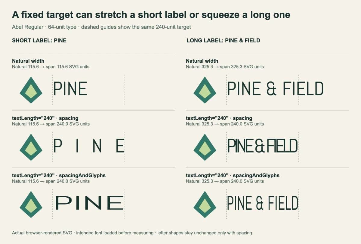
In the short label, spacing creates conspicuous gaps. In the long label, it crowds the letters together. The glyphs retain their shapes in both cases, yet neither result is a good fit for this design. The spacingAndGlyphs row reaches the same span by visibly changing the typeface's proportions.
Our test used Chrome 154 in the in-app browser. We measured the horizontal span from the first character's start position to the last character's end position; each adjusted row reached approximately 240 units. The fixture uses one Latin font and simple left-to-right text. It is not a cross-renderer or multilingual compatibility test.
Set a modest length correction
For the long label above, 330 units is close to its natural 325.3-unit length. That is a more useful calibration example than forcing it down to 240.
Download Abel-Regular.ttf and its OFL.txt from the Google Fonts Abel directory. Put them in a fonts folder beside an HTML file containing this markup, then serve that folder locally:
<style>
@font-face {
font-family: Abel;
src: url('./fonts/Abel-Regular.ttf') format('truetype');
font-style: normal;
font-weight: 400;
}
</style>
<svg xmlns="http://www.w3.org/2000/svg"
width="540" height="136" viewBox="0 0 540 136"
role="img" aria-label="Pine and Field emblem and label">
<path d="M25 80L63 24L101 80L63 114Z" fill="#287967"/>
<path d="M43 80L63 49L83 80L63 97Z" fill="#c2d998"/>
<text id="label" x="135" y="86"
font-family="Abel" font-size="64" font-weight="400"
textLength="330" lengthAdjust="spacing"
fill="#17372e">PINE & FIELD</text>
</svg>The unitless 330 belongs to the SVG's coordinate system. Scaling the whole SVG on a page also scales that distance on screen. Keep the emblem and text separate so a typography change does not alter the drawing.
The font still matters. textLength does not turn the letters into outlines or package the typeface. If the shape of the letters changes on another computer, diagnose SVG font substitution before adjusting their spacing.
For a maximum width, measure first
If the rule is “leave short labels alone, shrink only the long ones,” add that condition yourself. This example reduces font size, so the letters keep their proportions while becoming smaller in both dimensions.
Place this script after the SVG above. It replaces the fixed 330-unit adjustment with a 240-unit maximum:
<script type="module">
  const label = document.querySelector('#label');
  const baseSize = 64;
  const maxWidth = 240;

  await document.fonts.load('64px Abel', label.textContent);
  await document.fonts.ready;

  label.removeAttribute('textLength');
  label.removeAttribute('lengthAdjust');
  label.setAttribute('font-size', String(baseSize));

  const naturalWidth = label.getComputedTextLength();
  if (naturalWidth > maxWidth) {
    const fittedSize = baseSize * maxWidth / naturalWidth;
    label.setAttribute('font-size', String(fittedSize));
  }
</script>
document.fonts.ready waits for the document's font loading and layout work to settle. The explicit load() call requests the face used by this example first. Measuring before the intended face loads can make a fit decision using fallback lettering.
We remove textLength before calling getComputedTextLength(), because this branch needs the natural length. In our browser test, that method still reported the natural length for the spacing rows even though the displayed start-to-end span had changed. Do not assume it is a universal measurement of the adjusted visual width.
With this script, the short PINE label keeps its 64-unit size. The long label drops to about 47.2 units. Review the result at its actual display or print size. If the reduced words are too small, change the layout or wording instead of lowering the size indefinitely. Run the fitting step again when the wording or font settings change.
Check the final label in its destination
A numerical fit is only one check. Look at the letter pairs and the gap between emblem and text at the final size. Keep ordinary labels at their natural spacing unless the design needs calibration.
For multiple lines, create and position the lines intentionally; textLength alone supplies no wrapping policy. For a curved badge, use the separate SVG text-on-a-path workflow. That guide controls the baseline the letters follow.
Keep the source with live text, then open the delivery file in the actual editor, browser, or renderer that will use it. The SVG file guide explains why an SVG can contain editable text, vector paths, or an embedded image despite sharing the same extension.
If your starting logo exists only as a raster image, PerfectVector's logo vectorizer can recover artwork for the emblem. Inspect and clean those paths, then retype the words as live text before fitting the label. A traced word is path geometry; textLength cannot resize its character spacing. Our logo vectorization walkthrough covers that source-recovery step.
FAQ
Does textLength only shrink text that is too long? No. It requests a length, so it can also expand text that is naturally shorter. Measure the natural label and apply your own condition when you need a maximum-width rule.
Which lengthAdjust value preserves the letter shapes? Use spacing to adjust character spacing without stretching the glyphs. A large adjustment can still create awkward gaps or collisions, so inspect the lettering at its final size.
Can textLength fit lettering traced from a PNG? It operates on SVG text, not letter-shaped paths. Retype the wording as live text if you need textLength or editable character spacing, while keeping the emblem as separate vector artwork.
Sources
- W3C — SVG 2 text adjustment — The two modes and their effect on glyph shapes and advances.
- MDN — textLength — Requested length and the default spacing mode.
- MDN — FontFaceSet.ready — Waiting for font loading and layout.
- MDN — getComputedTextLength — Measuring an SVG text element.
- Google Fonts — Abel — The font and license used in the original comparison.
Recover a raster emblem with the logo vectorizer if you need one, then keep the lettering as a separate text element. Compare the final label at normal size before making an outlined delivery copy or raster export.
More from the blog
SVG Text Vertical Alignment: Center a Rebuilt Label
Align SVG labels with dominant-baseline, compare middle and central in two fonts, and distinguish text-box centering from the visible shape of the letters.
SVG Paint Order: Keep Thick Outlines Behind Lettering
Use SVG paint-order to put a thick stroke behind the fill. Compare real text and path renders, check small sizes, and keep an editable master for delivery.