
SVG clipPath vs Mask: Choose Hard Edges or Soft Fades
Compare SVG clipPath with alpha and luminance masks on one image. Copy the working pattern, test light and dark backgrounds, and export the right geometry.
On this page
Use an SVG <clipPath> when you want an image to stop at a defined contour. Use an SVG <mask> when the image should fade through partial transparency. A mask can also make a hard cut, but a clipping path states the simpler intent for a hard geometric edge. The CSS Masking specification defines these as separate visibility operations.
The choice matters when a logo-shaped image is headed into another editor. Both methods control what you see; neither turns the hidden pixels into deleted geometry or converts the image into vector paths. This guide uses one original raster scene and one contour, then changes only the visibility rule. You can apply the same test to your own art before export.
Choose by the edge you need
| Goal | Start with | What controls visibility | Check before delivery |
|---|---|---|---|
| Crop an image to a crisp logo or badge contour | <clipPath> | Inside or outside the path | Contour alignment and whether the destination preserves the clip |
| Fade the image toward an edge | <mask mask-type="alpha"> | The mask artwork's opacity | Transparent stops, mask region, and backdrop color |
| Use a white-to-black artwork as the fade | <mask mask-type="luminance"> | Brightness multiplied by opacity | Dark areas, transparent areas, and mask region |
| Produce permanent trimmed vector contours | Path editing or an intersection operation | The resulting paths themselves | Open and inspect the paths in the destination |
The visible edge of a clip can still have normal rendering antialiasing. What it cannot express is a deliberate band of partial visibility from a grayscale or opacity gradient inside the clipped shape. The MDN clipping and masking tutorial makes that distinction with small SVG examples.
Compare one image under three visibility rules
For this test, I drew a small landscape, rasterized it to a 400 × 240 PNG, and placed the same pixels under the same leaf-like contour in every panel. The left panel clips to that contour. The middle uses a white-to-black luminance mask; the right uses an opaque-to-transparent alpha mask. Both gradients were chosen to create the same left-to-right fade. Each result appears on light and dark backdrops, which makes the disappearing edge easier to judge.
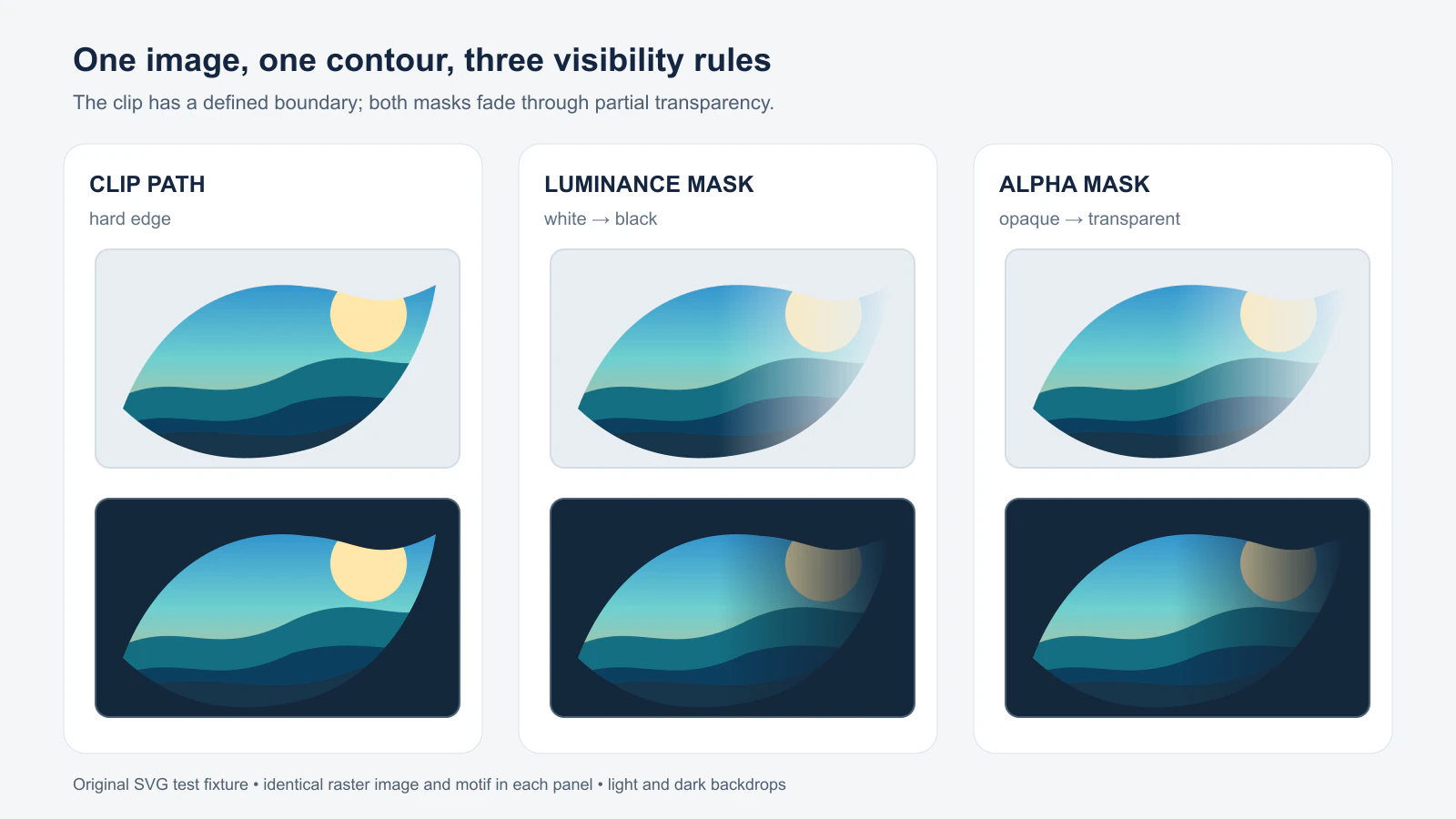
The two mask columns look similar here for a reason: the white-to-black luminance gradient and the white-opacity gradient encode comparable mask values. They are not interchangeable inputs. Opaque black hides under luminance masking, while opaque black remains visible under alpha masking. In alpha mode, the pixel's opacity determines the result; its black or white color does not. The CSS Masking mask-processing definition specifies both calculations.
Build the clip and mask from one contour
Save the following as clip-or-mask.svg, put your own photo.png beside it, and serve both files from the same folder over HTTP. The two images use one 400 × 240 coordinate system. They differ only in clip-path versus mask.
<svg xmlns="http://www.w3.org/2000/svg" viewBox="0 0 840 280">
  <defs>
    <path id="motif"
      d="M30 175 C65 82 140 28 232 41 C290 44 304 75 374 39
         C361 122 310 196 236 219 C139 246 75 217 30 175 Z" />

    <clipPath id="hard" clipPathUnits="userSpaceOnUse">
      <use href="#motif" />
    </clipPath>

    <linearGradient id="fade" x1="0" y1="0" x2="1" y2="0">
      <stop offset="0" stop-color="white" stop-opacity="1" />
      <stop offset=".45" stop-color="white" stop-opacity="1" />
      <stop offset="1" stop-color="white" stop-opacity="0" />
    </linearGradient>
    <mask id="soft" mask-type="alpha" maskUnits="userSpaceOnUse"
      maskContentUnits="userSpaceOnUse" x="0" y="0" width="400" height="240">
      <use href="#motif" fill="url(#fade)" />
    </mask>
  </defs>

  <g transform="translate(20 20)">
    <image href="photo.png" width="400" height="240"
      clip-path="url(#hard)" />
  </g>
  <g transform="translate(440 20)">
    <image href="photo.png" width="400" height="240"
      mask="url(#soft)" />
  </g>
</svg>
The reference IDs must be unique within the SVG. Both the clip and mask use userSpaceOnUse so the motif's coordinates line up with each image's local 400 × 240 area. The MDN <clipPath> reference describes clipping as restricting paint without changing the target's inherent geometry. The MDN <mask> reference separates maskUnits, which positions the mask region, from maskContentUnits, which positions its artwork.
To try luminance instead, duplicate the mask with a different ID, set mask-type="luminance", and change the gradient stops to opaque white at the start and opaque black at the end. Keep the mask reference in sync with that new ID. By default, an SVG <mask> uses luminance; this example names the mode so a future edit does not silently change the meaning of black. See MDN's mask-type reference.
Check the result before you export
- Render the SVG on both a pale and a dark background. A fade that seems invisible on white may be obvious on dark.
- Confirm that the image and motif use the same coordinates. If you resize only the image, the contour may no longer line up. For reusable clips on differently sized targets, the clipPath units guide explains the coordinate choices.
- If a soft edge ends abruptly, inspect the mask's
x,y,width, andheightas well as the gradient. The mask region can cut off artwork outside its bounds; widening the gradient alone will not fix a narrow region. MDN lists the mask region defaults, but explicit bounds are easier to review in a deliverable. - Reopen the saved SVG in the application that will use it. A correct browser render does not establish that another importer keeps the clip, mask, linked image, or editability you need.
- Inspect the file structure. If it still contains
<image>, it still contains raster pixels even though the clipping contour is vector. The embedded-raster check shows how to spot that distinction.
The image in this example remains a PNG. Clipping and masking do not trace it. If your job requires real cut geometry or a permanent transparent hole, make the corresponding paths in your editor and inspect the export. The filled-hole troubleshooting guide helps distinguish a real opening from a white patch that merely looks empty on a white canvas.
Where PerfectVector fits
If the contour you need survives only in a PNG or JPG logo, PerfectVector's image-to-vector workflow can give you an editable SVG candidate. Inspect its outer path, small gaps, and any unwanted background shapes before copying a contour into a <clipPath> or <mask>. You still choose the visibility method and build the effect in an SVG editor. Keep an existing clean vector master when one is available.
You do not need to vectorize a photograph merely to put it behind a mask. Leave photographic pixels as an image when preserving their detail matters. For a single-color icon controlled by CSS rather than an image inside SVG, the SVG CSS mask guide covers that separate workflow.
FAQ
Can an SVG clipPath create a gradual fade? No. A clipping path defines which parts of the target are visible, apart from ordinary antialiasing at its boundary. Use a mask with intermediate opacity or luminance values for a deliberate fade.
Does black hide an image in every SVG mask? No. Opaque black hides under luminance masking, but it reveals under alpha masking because the pixel is still opaque. Fully transparent artwork hides under either mode.
Does clipping or masking turn a PNG into vector artwork?
No. Both change visibility at render time. An SVG can still contain a raster <image> and may need separate tracing or path editing for a vector-only deliverable.
Sources
- W3C — CSS Masking Module Level 1 — Definitions of clipping, masking, and alpha versus luminance mask values.
- MDN — Clipping and masking — Hard clipping and soft mask examples.
- MDN —
<clipPath>— Clip behavior, coordinate choice, and unchanged underlying geometry. - MDN —
<mask>— Mask region, content coordinate system, and reference behavior. - MDN —
mask-type— Alpha and luminance interpretation of SVG mask artwork.
If a raster logo needs editable contours first, make an SVG candidate with PerfectVector, inspect the recovered path, then apply a clip or mask and reopen the exported file in its destination.
More from the blog

SVG Pointer Events: Match Click Areas to Your Artwork
Control SVG click areas with fills, strokes, holes, and separate hit targets. Test event routing and keep keyboard activation on a native button or link.

Unreal Engine SVG Import: Check Motion Design Geometry
Prepare an SVG for Unreal Engine Motion Design, inspect holes and separate pieces, and distinguish scene geometry from a texture or runtime UI image workflow.