Prepare Vector Artwork for Embossing and Debossing
Prepare vector artwork for embossing or debossing with clean solid shapes, a separate spot-color finish plate, realistic detail, and a proof-ready handoff.
On this page
- Embossing and debossing use physical relief
- Ask the printer before you simplify the art
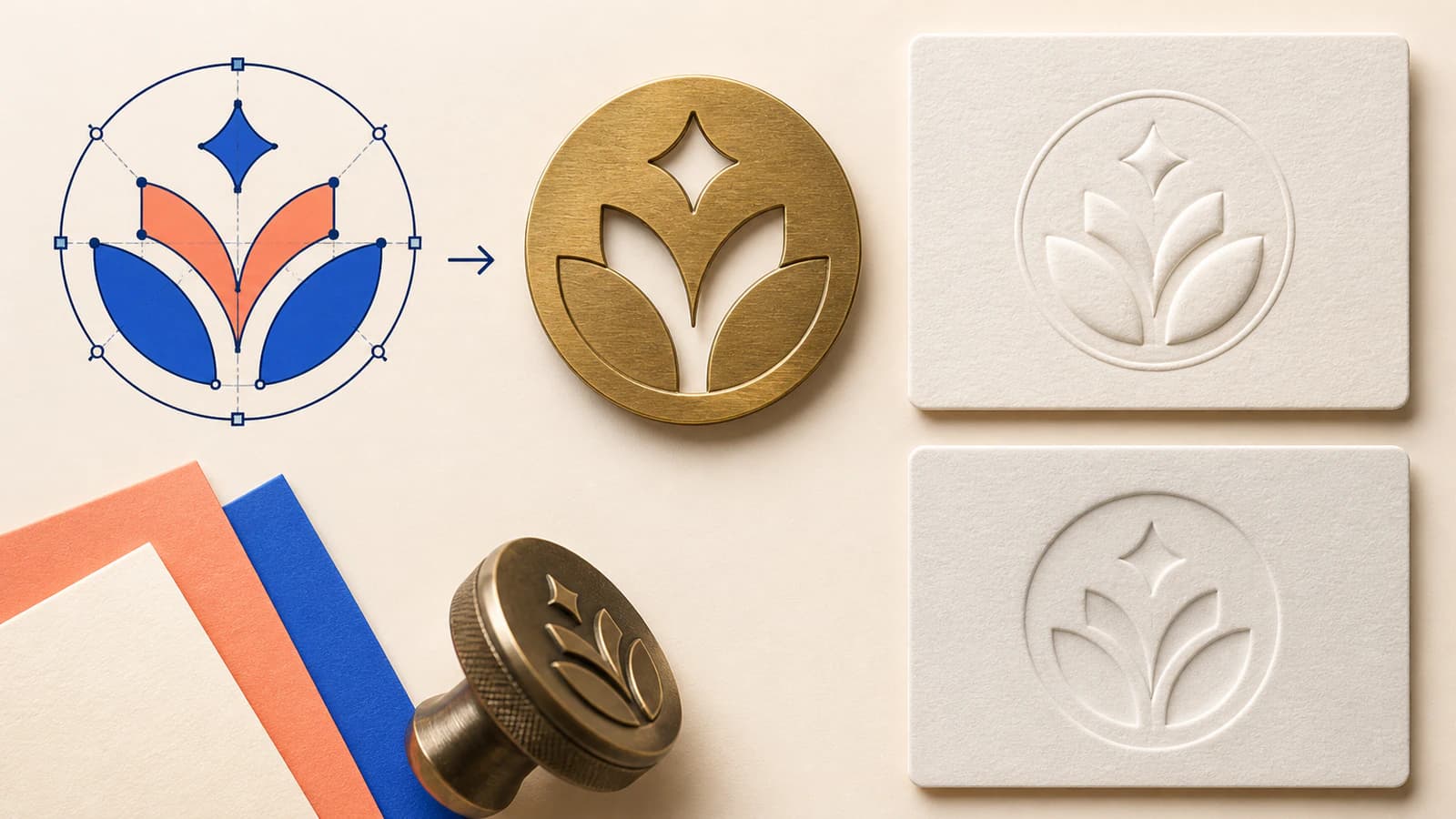
- Build a finish plate, not a screen effect
- Turn a raster logo into usable geometry
- Simplify for paper without changing the identity
- Design for registration, not perfect overlay
- Send two views of the same job
- Choose a proof that answers the real risk
- Final preflight
- FAQ
- Sources
To prepare vector artwork for embossing, build the area that should rise as clean, solid vector geometry at final size. Put it on a separate, clearly named layer or page, apply the printer's requested 100% spot color, and keep it distinct from ordinary print, foil, varnish, and cutting artwork. For debossing, the production setup is similar, but your job notes must say that the impression goes into the sheet rather than rising above it.
Do not choose universal minimum line widths, gaps, type sizes, or die depth from a generic checklist. Those limits change with the stock, die, artwork, press, and provider. Ask the printer for the exact values, then request a proof or manual prepress review before production.
The printer-ready sequence
- Ask for the provider's template, accepted format, spot-color name, feature limits, and proof options.
- Confirm whether each finish is emboss, deboss, blind, printed, foiled, coated, or combined.
- Rebuild the impression area as clean vector shapes at final size.
- Isolate that geometry on a named layer or separate page in one solid spot color.
- Outline approved type in the delivery copy and inspect counters, gaps, corners, and overlaps.
- Supply a flattened appearance preview alongside the editable production file.
- Review the finish-only separation and the provider's proof before approving the job.
Embossing and debossing use physical relief
Embossing raises part of the sheet with a custom die. Debossing presses the area into the sheet. QinPrinting's embossing and debossing file guide describes this direction difference and recommends vector graphics, separate artwork layers, and clearly named spot colors for the finish.
Even when the on-screen separations look identical, include a plain job note such as “raise this mark” or “press this mark into the front.” Put different directions on separate, unambiguously named layers or pages.
For clay marks, compare raised and recessed pottery-stamp designs to distinguish the tool face from the finished impression. To prepare the motif itself, use the pottery-stamp artwork workflow.
A blind emboss or deboss has no ink or foil registered to the impression. A registered version aligns the relief with printed ink, foil, or another finish. When foil shares the same mark, use the foil-stamping vector artwork checklist to keep the two finish separations distinct. Registered work is less forgiving because a small shift can expose a halo or make a thin border look uneven.
Ask the printer before you simplify the art
Start with the production specification, not with a random preset. Send the provider these questions:
- Which editable or print-ready file formats do you accept?
- What should the finish layer, page, or spot swatch be named?
- What are the minimum positive line, reversed gap, text, and isolated-dot sizes for this stock?
- How close may the impression sit to trim, folds, scores, glue, or other finishes, and should strokes be expanded?
- What registration tolerance and proof workflow apply?
Greenerprinter's finishing and bindery guide gives a useful example of a provider-specific workflow. It asks for each special finish on a named separate layer or page, built as solid vectors with one named 100% spot color. It also warns against soft edges, gradients, tiny detail, and alignment that depends on hairline registration. Use those principles as a preparation model, then follow your own provider's exact requirements.
Build a finish plate, not a screen effect
If you want an appearance mock-up for a web logo, an SVG lighting treatment can add diffuse shading and specular shine while keeping a separate flat master. Keep that display version apart from the solid finish plate; its alpha-based lighting calculation supplies screen paint rather than die geometry.
The production layer should answer one question: where does the die act? Use closed, filled vector shapes. Remove shadows, blurs, gradients, raster textures, blend modes, and transparent highlights. Those effects can stay in a separate mock-up, but they do not describe a binary die region. Confirm whether the provider accepts strokes or wants them expanded.
Keep print, foil, spot UV, die-cut, and emboss artwork on separate, aligned layers. Even when finishes share a visual mark, production still needs independent definitions.
Use the exact spot-color name the provider requests. A blue or magenta display color is often chosen only because it is easy to see on screen. The swatch does not describe the paper color or the height of the relief.
Turn a raster logo into usable geometry
If the only source is a PNG or JPG, first look for the approved vector master. Reconstructing the logo should be the fallback, especially for licensed type or exact brand geometry.
Automatic vectorization works best for a clean, high-contrast emblem, monogram, or silhouette. PerfectVector can convert a raster logo into editable vector paths before you prepare the finish separation. Treat the result as reconstruction material: compare it with the approved source, correct the lettering, simplify noisy curves, preserve negative spaces, and then apply the printer's production rules.
Redraw critical elements when the source is blurry, heavily textured, or too small to reveal the intended shape. A trace may reproduce pixel wobble that becomes obvious in plain paper.
Simplify for paper without changing the identity
Embossing rewards decisive shapes. Fine lines can weaken, narrow gaps can close, and tiny counters may not hold their form. Yet aggressive simplification can turn a recognizable logo into a generic symbol.
Review the artwork at its final physical size:
- Hide every layer except the finish plate.
- Inspect narrow bridges, small holes, acute corners, and isolated dots.
- Remove stray points, duplicate objects, self-intersections, and accidental overlaps.
- Join shapes that should form one impression region.
- Compare the cleaned silhouette with the approved logo.
- Measure the smallest remaining feature and ask the printer to approve it.
Typography needs its own check. Keep an editable master with live text. In the delivery copy, outline final approved type if the provider asks, then inspect counters and tight joins again. Outlining prevents font substitution, but it does not make tiny letters manufacturable.
Design for registration, not perfect overlay
When embossing aligns with ink or foil, avoid geometry that makes a tiny shift look catastrophic. Ask whether one element should spread, choke, or remain visually independent. Do not invent trapping values; the correct adjustment depends on the production sequence and equipment.
For blind work, evaluate the mark through light and shadow. Paper texture, weight, coating, and grain change how strongly the relief reads. The provider must balance depth with the stock and construction.
Send two views of the same job
Deliver an editable production file with the finish separation, plus a flattened PDF or image that shows the intended appearance. The print-shop vector handoff guide explains why the editable file and visual reference should travel together. The preview helps prepress catch a reversed direction, missing element, or registration misunderstanding without interpreting layer names alone.
Identify the final size, orientation, emboss or deboss direction, blind or registered treatment, finish layer, stock, and critical placement notes.
Inspect the export. Confirm that only intended solid shapes appear, required spot colors remain spots, no bitmap is embedded in the finish plate, and all artboards share an origin.
Choose a proof that answers the real risk
A soft proof can confirm content, placement, separations, and stated job details. It cannot let you feel the paper. A printed mock-up may help with scale and stock but may omit the finishing process. Greenerprinter's proof options guide makes this distinction explicit: its mock-ups do not include finishing, while a fully finished prototype can require purchasing the embossing, debossing, or cutting die upfront.
Ask what the offered proof actually includes. For a low-risk repeat job, manual prepress and a soft proof may answer the remaining questions. For a new stock, subtle blind mark, expensive run, or close registration, a finished prototype or production test may be worth the added time and cost.
Approve the proof only after comparing it with both the finish-only plate and the appearance preview.
Final preflight
- The artwork is at final size and uses the provider's template.
- Emboss and deboss directions are written in plain language.
- Each special finish has its own named layer or page.
- The finish plate contains solid vector shapes, not raster effects.
- Type treatment and expanded strokes match the provider's request.
- Small lines, gaps, counters, and isolated details have written approval.
- Registered finishes allow the provider's stated tolerance.
- The editable file and flattened preview agree.
- The proof type is understood before approval.
FAQ
What file format should I send for embossing? Send the AI, EPS, PDF, SVG, or other format your printer names. The important part is usable vector geometry, a separate finish definition, correct scale, and the provider's required spot-color or layer setup.
What is the difference between embossing and debossing? Embossing raises an area above the sheet. Debossing presses it into the sheet. Label the intended direction in the production file and job notes.
Should text be outlined for embossing artwork? Outline final approved text in the delivery copy when the printer requests it, and retain an editable master. Outlining prevents font substitution but does not solve features that are too small for the process.
Can a gradient logo be embossed? The die region is a physical shape, so the production separation is normally solid. Keep gradients or lighting effects in the printed artwork or visual mock-up, and ask the provider how any combined processes should be separated.
What is the minimum line width for embossing? There is no reliable universal number. The limit depends on stock, die, depth, artwork size, and provider. Ask for the current minimum line, reversed gap, text, and isolated-detail specifications for the exact job.
Sources
- QinPrinting: How to Prepare Print Files for Embossing and Debossing — Emboss versus deboss direction, vector artwork, separated finish layers, and spot-color preparation.
- Greenerprinter: Finishing and Bindery — Separate named layers, solid vector shapes, 100% spot color, realistic detail, registration, flat previews, and manual prepress.
- Greenerprinter: Proof Options — Soft and manual proofs, printed mock-up limitations, color proofs, and finished prototype considerations.
If a suitable logo exists only as pixels, reconstruct clean vector paths, prepare a separate finish plate, and send both the production file and appearance preview to the printer for approval.
More from the blog

Overprint vs Knockout: Check How Your Logo Prints
Compare overprint and knockout with separate ink-mask diagrams, understand disappearing process-white artwork, and check the actual print delivery file.
Packaging Dielines: Check Bleed and Safe Areas
Place backgrounds and logos on a supplier's packaging dieline, check bleed and cut or fold clearance, and preserve the structural template before handoff.