Pottery Stamps: Choose a Raised or Recessed Mark
Choose the clay impression before ordering a pottery stamp. Compare raised and recessed faces, label mirrored artwork, and check small details with the maker.
On this page
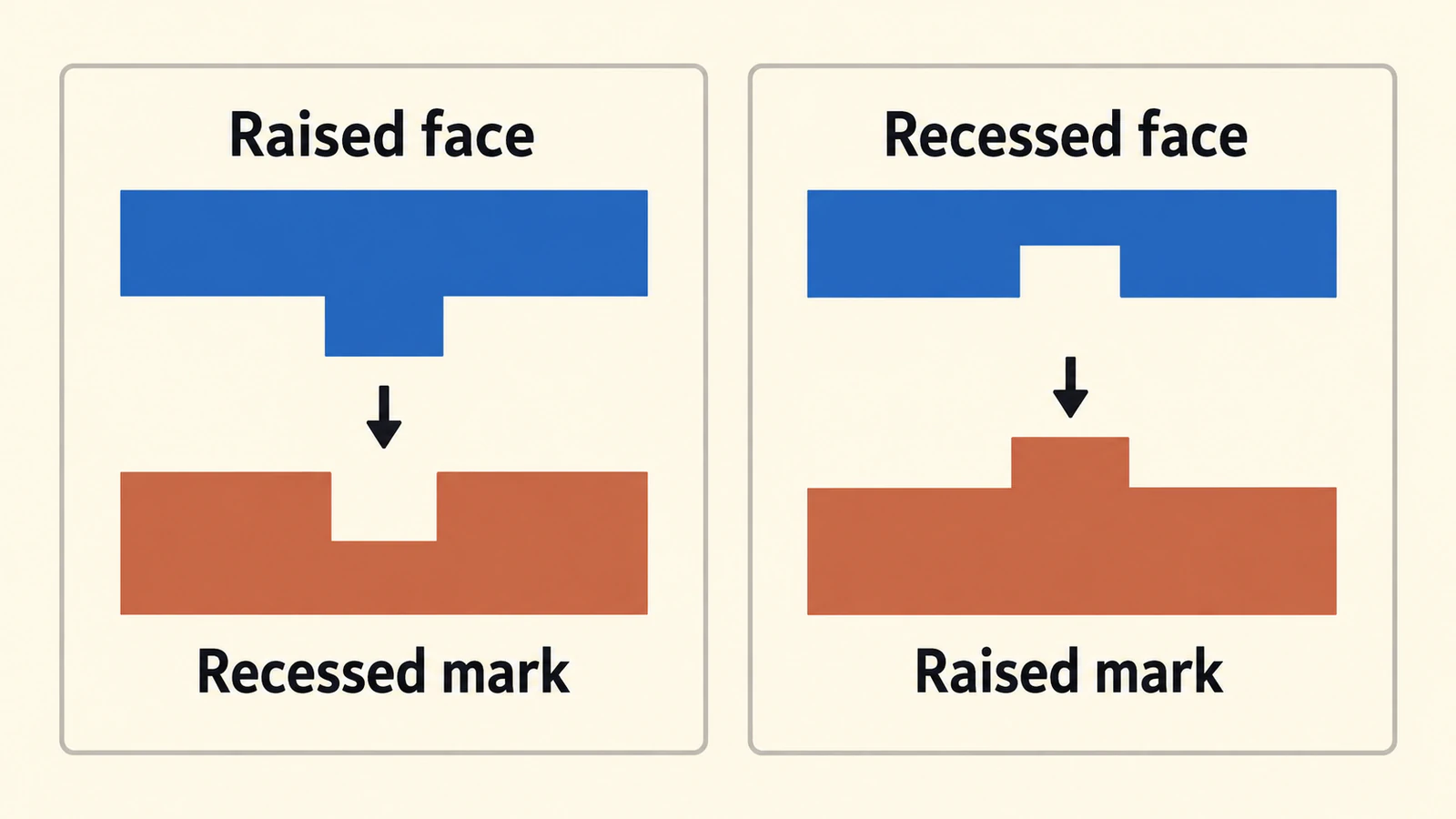
Choose the mark you want to see in the clay before choosing the stamp face. A raised feature on the stamp presses a recessed mark into clay. A recessed feature in the stamp can leave that motif raised relative to the surrounding pressed field.
That reversal is why "a raised pottery stamp" is an incomplete order description. It could mean raised lettering on the tool or raised lettering in the finished impression. Write which surface you mean, then ask the stamp maker to confirm the opposite face geometry in the proof.
The useful starting point is a small appearance decision: should your signature sink into the surface, or should the letters stand above a depressed background?
Name the clay result first
Use these descriptions when discussing the job:
| Intended clay result | Corresponding stamp face | Plain-language order note |
|---|---|---|
| The motif is recessed into the clay | The motif projects from the stamp face | Press these lines into the clay |
| The motif stands above the surrounding pressed field | The motif is recessed into the stamp face | Leave this motif raised within the impressed field |
Black Oak Art describes carving a design into a clay slab, firing the stamp, and using it to make clay relief for a mug. That is an example of the recessed-face route.
"Raised" here is relative to the surrounding impression. It does not promise that the mark will rise above the untouched clay surface. The stamp design and your clay process determine the actual profile.
For a simple maker's signature, you might want only the handwriting pressed into the surface. For a small badge, you might prefer initials standing inside a depressed circle. Neither choice is automatically clearer or better. Decide which appearance belongs on your work, then have the maker assess the design at the intended size.
The embossing and debossing artwork guide uses the same habit of naming the intended relief direction. Its paper-production rules do not transfer automatically to pottery stamps.
Keep three views separate
A black-and-white drawing, a stamp face, and a clay impression describe different stages. Put a clear label on each view you send or approve.
- Artwork, reading normally: the signature, initials, or motif as you want people to recognize it.
- Stamp face: the maker's view of the tool, with raised and recessed areas identified.
- Intended clay impression: the readable result, with the mark's relief direction stated.
Take an original sprig with two leaves on the left and one on the right. That asymmetry makes orientation visible. Put the initials "LM" beside it in an appearance sketch and you can also check whether lettering reads correctly. A perfectly symmetrical icon can hide a mirroring mistake until another part of the design reveals it.
Use the same mark in all three views. Do not silently swap a black drawing for its inverted white version and assume that the maker knows whether you changed color, background, or relief direction.
Mirroring is a separate decision from relief
The contact face and its impression read as mirror counterparts when each is viewed face-on. Relief describes height; mirroring describes orientation. Reversing black and white does not mirror a signature, and flipping the artwork horizontally does not turn a raised feature into a recess.
Ask the supplier whether it wants normally reading artwork and performs the face reversal itself, or requires a prepared mirrored view. Keep your master reading normally. If you send a mirrored reference, label it stamp face view and include the intended readable impression beside it.
This avoids a double reversal. A file that you mirrored and a supplier that mirrors incoming artwork again can produce a different orientation from the one you intended.
For handwriting, start with the original flat signature. The signature-to-SVG guide covers recovering the visible strokes; it does not decide which side of a stamp should face the clay.
Black artwork does not specify height by itself
A flat SVG carries contours and painted regions. It does not tell the stamp maker that black means raised tool material, recessed tool material, or the visible mark in clay unless the order defines that convention.
Use a note such as:
Artwork reads normally. The black sprig should appear recessed in the clay. Please confirm the corresponding stamp face, who handles mirroring, and whether the open spaces work at the ordered size.
For the opposite look, change the result explicitly:
The initials should stand raised relative to the surrounding impressed circle. Please show that clay impression and identify the recessed areas of the stamp face in the proof.
These are example job notes, not universal supplier instructions. Follow the maker's requested file convention after agreeing on the appearance.
Open counters deserve their own check. The empty area inside a letter or between leaves is part of the design. If an SVG counter unexpectedly becomes a filled object, use the filled-hole diagnosis before sending the file. A visual white patch and a genuine opening in vector geometry are not always the same structure.
Ask about detail at the ordered size
A mark that looks open when enlarged on screen can have cramped gaps at the size you order. Review the spaces between letters, the gap between a leaf and stem, narrow bridges, and isolated dots.
JH Machining's pottery-stamp guidance asks customers to consider spacing and extremely fine detail. Use that as a reason to request a maker's review, rather than borrowing a universal minimum line width or relief depth from another shop.
Show the maker the dimensions you intend to order and identify any feature that must survive. Ask whether a gap should widen, a stroke should change, or a tiny decorative detail should be removed. Keep the approved drawing beside the revised version so that simplification does not quietly change the identity of the mark.
A screen proof can establish the agreed artwork and orientation. Ask separately whether the offered proof includes a physical impression in clay. A shaded drawing of the stamp is not evidence of how your clay, moisture, pressure, or later processing will behave. JH Machining also recommends trying the stamp on scrap clay; a test with your actual process answers questions the vector file cannot.
Send the format your maker wants
Vector artwork can help when you need to inspect or revise contours, but suppliers do not all require it.
- InkBird Print Studio prefers black-and-white SVG or PDF and also accepts suitable high-contrast artwork.
- 4clay's Signature Writer page lists raster and vector handoffs and describes a proof before production.
- JH Machining accepts several artwork sources, including drawings and signatures, and gives its own preparation guidance.
If the maker accepts your clear original drawing and will prepare it, there may be no separate vectorization job. If editable paths will help the discussion, keep the SVG and a labeled appearance preview together. Neither file replaces the maker's manufacturing specification.
Where PerfectVector fits
If your approved mark exists only as a flat PNG or JPG, PerfectVector's pottery-stamp artwork converter can reconstruct SVG paths for inspection. Compare the signature joins, letter counters, leaf tips, and gaps with the original before sending the reviewed file to your supplier. The tool prepares artwork; it does not make an STL, add relief depth, mirror the stamp face, or guarantee a clay result.
Use the original drawing instead of a photograph of an existing clay impression when possible. Surface texture, shadows, and the impression's distortion can become shapes in a trace. If you already have a suitable vector master, preserve it and make the requested edits directly. The vectorization explainer covers what a raster-to-path conversion reconstructs.
Before approving the order, confirm the readable clay view, relief direction, final dimensions, mirroring responsibility, and any revised fine detail. Keep the maker's approved proof with the artwork so the same instructions are available for a repeat order.
FAQ
Does a raised stamp make a raised mark in clay? A raised feature on the stamp presses a recessed mark into the clay. A recess in the stamp face can leave the motif raised relative to the surrounding pressed field. Specify whether you are describing the tool or the clay impression.
Should I mirror artwork for a pottery stamp? Ask the supplier who handles the reversal. Keep a normally reading master and provide a labeled intended impression. If the supplier requests a mirrored stamp-face view, label it clearly so the artwork is not reversed twice.
Does black mean raised or recessed on the stamp? Only if the supplier's instructions define it that way. A black-and-white drawing does not specify relief height by itself. State what the black regions should look like in the clay and ask the maker to confirm the corresponding stamp face.
Do I need an SVG to order a pottery stamp? Not always. Some makers accept clear drawings or raster files, while others prefer SVG or PDF. Confirm the requested handoff first. Vectorize suitable raster artwork when editable contours help, then have the maker review the result at the ordered size.
Sources
- InkBird Print Studio — Maker's Mark Stamp for Pottery, Ceramics & Clay — Describes its preferred black-and-white artwork and accepted file types.
- 4clay — Signature Writer Clay Stamp — Lists artwork handoffs and the supplier proof process.
- JH Machining — Custom Pottery Stamp — Gives artwork, spacing, fine-detail, and clay-use guidance for its service.
- Black Oak Art — Carved Stamp and Clay Relief — Describes a maker's carved-stamp process for producing applied clay relief.
Need editable paths for the maker's review? Prepare your pottery mark as SVG, inspect its open spaces, and send it with a note that states the clay result you want.
More from the blog

Double-Sided Game Tokens: Match Front and Back
Match the fronts and backs of game tokens with a numbered sheet example. Check long-edge and short-edge layouts, readable symbols, and a separate paper proof.

Pinback Button Artwork: Face, Wrap and Safe Area
Prepare pinback button artwork with a measured radial example. Keep the logo on the face, preserve the template size, and follow the maker's bleed instructions.