
Vectorize Artwork for Foil Stamping: A Print Checklist
Prepare vector artwork for foil stamping with a separate foil mask, clean solid shapes, printer-specific spot colors, outlined type, and a proof-ready export.
On this page
- Start with the printer's specification, not a universal preset
- What belongs in the foil mask?
- Rebuild a raster logo as production geometry
- Clean the paths before assigning foil
- Build one unambiguous foil separation
- Decide overlap behavior with the printer
- Outline type only after approval
- Preflight at final size
- Keep the mockup separate from the manufacturing file
- Common foil-artwork failures
- FAQ
- Sources
To prepare vector artwork for foil stamping, isolate every area that should receive foil on its own vector layer or separation. Use solid shapes with no gradients, transparency, or photographic texture. Then apply the spot-color name and file format specified by your printer, remove accidental overlaps, outline approved type, and proof the foil mask separately from the printed artwork.
The separation is more important than the color you see on screen. A gold fill does not tell a production team to use gold foil, and a glossy mockup is not a manufacturing file. Your supplier needs an unambiguous map of where the die, plate, or digital foil process should apply material. When the same mark also rises or recesses, use the embossing and debossing artwork guide to separate the physical relief and proof its direction.
The printer-ready sequence
- Ask the printer for its foil template, spot-color name, minimum feature sizes, bleed, and preferred export.
- Rebuild the foil area as clean vector shapes.
- Place those shapes on a clearly named foil layer or separation.
- Use one solid spot color exactly as instructed; avoid gradients and opacity.
- Resolve overlaps, outline approved type, and check small gaps and counters.
- Export the requested file and inspect a foil-only proof at final size.
Start with the printer's specification, not a universal preset
Foil workflows share a principle—a separate, solid mask—but production details vary. One printer may ask for a specifically named spot color in a PDF. Another may want a 100% black layer, a separate page, or an EPS or Illustrator file. Minimum line weight, text size, spacing, bleed, trapping, and registration tolerance also depend on the press, substrate, artwork, and supplier.
That is why this guide does not combine the smallest numbers found on different print-shop pages into one supposedly safe rule. Treat the printer's current template and written approval as the source of truth for that job.
For example, Print Peppermint's foil artwork guidance asks customers to define the foil area separately and describes solid vector artwork as the suitable basis. QinPrinting's current file-preparation guide likewise calls for vector foil areas filled with a clearly named spot color. The exact thresholds on those pages belong to their workflows, not every foil vendor.
For tissue napkins, first compare foil and ink printing from your artwork to decide whether a foil mask is the right route.
Before drawing, send five questions:
- What file format and PDF standard should I deliver?
- What must the foil spot color or layer be named?
- Should foil shapes overprint, knock out, or be supplied as a separate file?
- What are the minimum line, gap, reversed-text, and type sizes for this stock?
- How should foil extend or retreat where it meets print, folds, trims, or embossing?
Write the answers into the job notes. If the printer supplies a template, build inside it rather than recreating trim, safe area, or fold guides from memory.
What belongs in the foil mask?
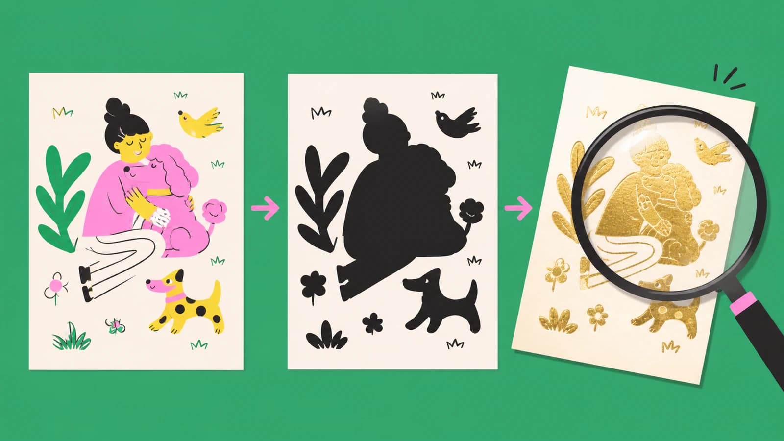
The foil mask contains only the areas intended to receive foil. It should be understandable when all other artwork is hidden.
Good mask objects include:
- closed filled shapes for logos, borders, icons, and panels;
- deliberately stroked paths only when the printer accepts strokes;
- outlined letterforms after the wording and type choice are final;
- a measured bleed or choke where the printer requests one.
Remove raster images, shadows, glows, gradient meshes, blend modes, opacity, and decorative textures from the production mask. Those effects can remain in a visual mockup, but a binary foil separation needs a clear yes-or-no answer at every location.
QinPrinting's foil-stamping file guidance describes the foil content as a separate spot-color layer and warns against effects that do not translate into a solid foil plate. Mixam's foil setup guide also treats foil as a distinct artwork element with its own setup requirements. Their interface details and accepted formats may differ; the shared lesson is separation, not interchangeability.
For a napkin motif, prepare the artwork as vector shapes, then apply that supplier's foil specification.
Rebuild a raster logo as production geometry
A low-resolution PNG may look acceptable in a screen mockup but break down when converted into a physical foil shape. Start with the logo vectorization decision guide when you need to choose between tracing and a redraw.
Automatic vectorization is most useful for:
- a flat logo with strong edges;
- a one-color emblem or monogram;
- a high-contrast ornament;
- a silhouette without tiny distressed details.
Redraw manually when the source contains precise typography, symmetric geometry, dimension-critical borders, or important negative spaces. Retype a wordmark with the correct licensed font—or obtain the original vector—from the brand owner instead of tracing fuzzy letter edges.
For suitable flat artwork, PerfectVector can convert the image to editable EPS-style vector artwork. Use that result as a reconstruction stage, not as the final prepress file. Open the vector in your production editor, remove unwanted background shapes, consolidate the foil objects, and apply the printer's required spot separation.
If EPS is not the printer's requested handoff, keep an editable SVG or native document while you clean the paths, then export the approved format. File extension alone does not make the artwork press-ready.
Clean the paths before assigning foil
Inspect the reconstruction in outline view and at high zoom. Foil makes edge defects conspicuous because the reflective area draws attention to every bump and gap.
Check for:
- Open contours. A filled region should close deliberately. Tiny breaks can create unpredictable fills or require repair downstream.
- Doubled edges. Overlapping copies may look like one line on screen but produce unnecessary paths.
- Hidden shapes. A white object is still an object. Delete pieces that are not meant to be part of the foil separation.
- Compound-path errors. Letter counters and interior cutouts must remain open where foil should not print.
- Excess nodes. Pixel-following traces create lumpy curves and make later trapping or editing difficult.
- Near-touching details. Two features separated by a hairline gap may bridge in production; get the supplier's minimum.
- Stray points. A single off-canvas point can enlarge the artwork bounds or confuse automated preflight.
Simplify selectively. A curve with fewer well-placed nodes is easier to proof, but aggressive simplification can alter a monogram or close a critical counter. Compare the cleaned path to the approved source before moving on.
Build one unambiguous foil separation
Create a top-level layer with the printer's requested name. Move only the foil objects into it. If the printer requires a named spot swatch, create that swatch exactly—capitalization included when their workflow depends on it—and apply it consistently.
Do not use a process CMYK recipe merely because it looks metallic on screen. The production signal is the spot separation or standalone mask, not the preview color. You can choose an obvious temporary display color for checking, but the final file must follow the printer's convention.
Avoid mixing several spot swatches that all mean the same foil. A duplicated swatch such as “Foil,” “Foil 1,” and “Gold Foil” can create multiple separations. Use a separation preview or output preview to confirm that hiding the foil plate removes every foil object and nothing else.
When a design contains two actual foil colors, embossing, or a foil-plus-varnish combination, ask whether each effect needs a separate plate, page, or file. Do not infer the production structure from how layers are arranged in a previous job.
Decide overlap behavior with the printer
Foil often sits next to or over printed ink, but the correct overlap depends on the process and desired effect. A screen preview cannot tell you whether the supplier wants the underlying print knocked out, allowed to continue beneath the foil, or trapped around it.
Keep print artwork and the foil mask separate enough that either choice can be made deliberately. Do not use transparency to simulate an overlap. Ask the printer how its proof represents foil and whether the submitted spot should be set to overprint.
This is also where registration matters. Very fine foil aligned exactly to a printed hairline or tiny reversed letter may be fragile even when both files are technically correct. If registration tolerance is important to the design, show the printer the actual-size detail early and ask for a physical or contract proof appropriate to the job.
Outline type only after approval
Live type is useful during editing, but it can substitute or reflow when the recipient lacks the font. After the copy, kerning, line breaks, and size are approved:
- save an editable master with live type;
- duplicate the production version;
- convert the foil text to outlines if the printer requests it;
- check counters, joins, and small punctuation;
- confirm the outlined copy still matches the approved text.
Outlining does not fix a type size that is too small for the foil process. It only converts glyphs into paths. Compare the thinnest stroke, smallest counter, and tightest letter spacing with the supplier's limits at final printed size.
Preflight at final size
Zooming in makes almost any vector look manufacturable. Preflight the placed artwork at the size it will actually print.
Use this foil-only check:
- Hide every non-foil layer. Does the remaining mask match the intended effect?
- Switch to outline view. Are there stray paths, clipping masks, or doubled contours?
- Open separation preview. Is there exactly one plate per intended foil or effect?
- Measure the smallest positive line, reversed gap, counter, and isolated dot.
- Check foil near trim, folds, scores, perforations, and embossed areas.
- Confirm the artboard, trim box, bleed, and orientation match the printer template.
- Reopen the exported PDF, EPS, or AI file rather than trusting the source document.
- Print a black-and-white foil mask at 100% and inspect it without the mockup.
A desktop print cannot reproduce foil transfer, pressure, heat, stock texture, or registration. It can expose missing objects, tiny counters, wrong scale, and accidental separations before the file reaches production.
Keep the mockup separate from the manufacturing file
Clients often need a realistic gold, silver, holographic, or colored-foil preview. Make that presentation in a separate mockup document or nonprinting layer. Label it clearly as a simulation.
The production file should remain boring: solid geometry, explicit separations, final dimensions, and the supplier's requested export. A beautiful metallic gradient can explain intent, but it should never be the only description of the foil area.
Archive three things together:
- the editable master with live type and construction history;
- the exact submitted production file;
- the printer's written specifications and approved proof.
That package makes a reprint safer. It also records which rules belonged to this supplier and substrate instead of turning them into a permanent but possibly wrong house standard.
Common foil-artwork failures
| What you see | Likely cause | Fix |
|---|---|---|
| Foil appears as ordinary yellow ink | Gold-looking process color, no spot separation | Build the required foil swatch or standalone mask |
| A letter counter fills in | Compound path broke during tracing or export | Rebuild the counter and inspect the exported separation |
| Curves look rough in the proof | Raster edge was traced too literally | Clean nodes while comparing to the approved source |
| Several foil plates appear | Duplicate spot swatches | Consolidate objects under the exact approved swatch |
| Tiny details disappear or bridge | Features are below the supplier's limits | Enlarge, simplify, or get a printer-approved exception |
| Foil and ink do not align as expected | Registration and overlap were assumed | Agree on knockout, overprint, trap, and tolerance before output |
| Printer requests a new file | Correct-looking art used the wrong template or format | Rebuild the export from the printer's current specification |
FAQ
Does foil artwork have to be vector? Many foil printers prefer or require vector shapes because a clean separation needs defined edges and scalable geometry. Follow your supplier's specification; photographic or variable-data digital foil workflows may differ.
Can I use a gold gradient to show where the foil goes? Use a gradient only in a separate visual mockup. The production foil mask should normally be a solid spot-color or standalone separation with no gradient, opacity, or metallic texture.
Should a foil layer overprint? Do not assume. Some workflows request overprint; others want a knockout or separate mask. Ask the printer and verify the exported separation preview.
Can I turn a PNG logo into foil-stamping artwork? A clean, high-contrast logo can be reconstructed as vector paths, but the trace still needs path cleanup, type verification, a printer-specific foil separation, and an actual-size preflight.
What file should I send for foil stamping? Send the exact PDF, EPS, AI, or other format named by the printer. Include the foil mask or spot swatch as instructed, and keep an editable master plus the approved proof in your archive.
Sources
- Print Peppermint — How to Prepare Artwork for Foil Stamping — foil separation, vector-artwork, and supplier-specific setup guidance.
- QinPrinting — Prepare Print-Ready Files for Foil Stamping — separate spot-color artwork and solid mask preparation.
- Mixam — Foil Artwork Setup — distinct foil artwork and export setup within a commercial print workflow.
Starting with a flat logo or ornament? Convert it to editable EPS-style vector artwork, clean the paths, and build the printer's required foil separation before you submit the job.
More from the blog

Logo Clear Space: Calculate and Preserve the Margin
Choose a clear-space unit for your logo, calculate the full exclusion zone, and preserve it in an SVG without confusing artwork size with the padded canvas.

Optically Center a Logo and Keep Its Master Intact
Start with geometric logo bounds, compare an optical offset at the intended size, and record the placement separately so the original vector master stays intact.