
SVG Symbol Sprites: Keep IDs, ViewBoxes, and Colors
Build an SVG symbol sprite with two icons. Preserve IDs and viewBoxes, set color behavior, and check external references and accessible names in context.
On this page
An SVG symbol sprite stores named icon definitions in one SVG file. Each visible icon uses a <use> element to reference the definition it needs. The packaging works only if the fragment ID, coordinate system, and paint rules survive the move from individual files.
Start with two icons before combining a full folder. In this walkthrough, a leaf uses a square coordinate space and a right arrow uses a wide one. The leaf will appear in two colors without duplicating its path. The arrow will keep its proportions instead of being forced into the leaf's canvas.
If your source icons still need consistent shapes, padding, or optical weight, finish the SVG UI-kit preparation workflow first. A sprite organizes artwork; it does not repair it.
Create two named symbol definitions
Save this original example as sprite.svg:
<svg xmlns="http://www.w3.org/2000/svg">
  <symbol id="pv-leaf" viewBox="0 0 24 24">
    <path fill="currentColor"
      d="M5 19C2 10 9 4 20 4C20 15 14 22 5 19Z"/>
  </symbol>
  <symbol id="pv-arrow" viewBox="0 0 32 16">
    <path fill="currentColor"
      d="M2 5H21V1L30 8L21 15V11H2Z"/>
  </symbol>
</svg>
The leaf's name is pv-leaf; the arrow's name is pv-arrow. These are the identifiers the page will request. MDN describes symbol as a reusable graphics definition instantiated through use. A file containing only symbols can look blank when opened on its own because the definitions are not directly rendered.
Keep the viewBox with the artwork it describes. Here, the leaf uses 0 0 24 24 and the arrow uses 0 0 32 16. Those numbers define coordinate bounds, not a required display size. Changing the arrow's bounds to 24 by 24 without adjusting its geometry is not normalization. See MDN's viewBox reference for the mapping between coordinates and the viewport.
For an existing icon family, keep its agreed grid. The mixed shapes here make a different point: packaging should preserve the coordinate system you already approved.
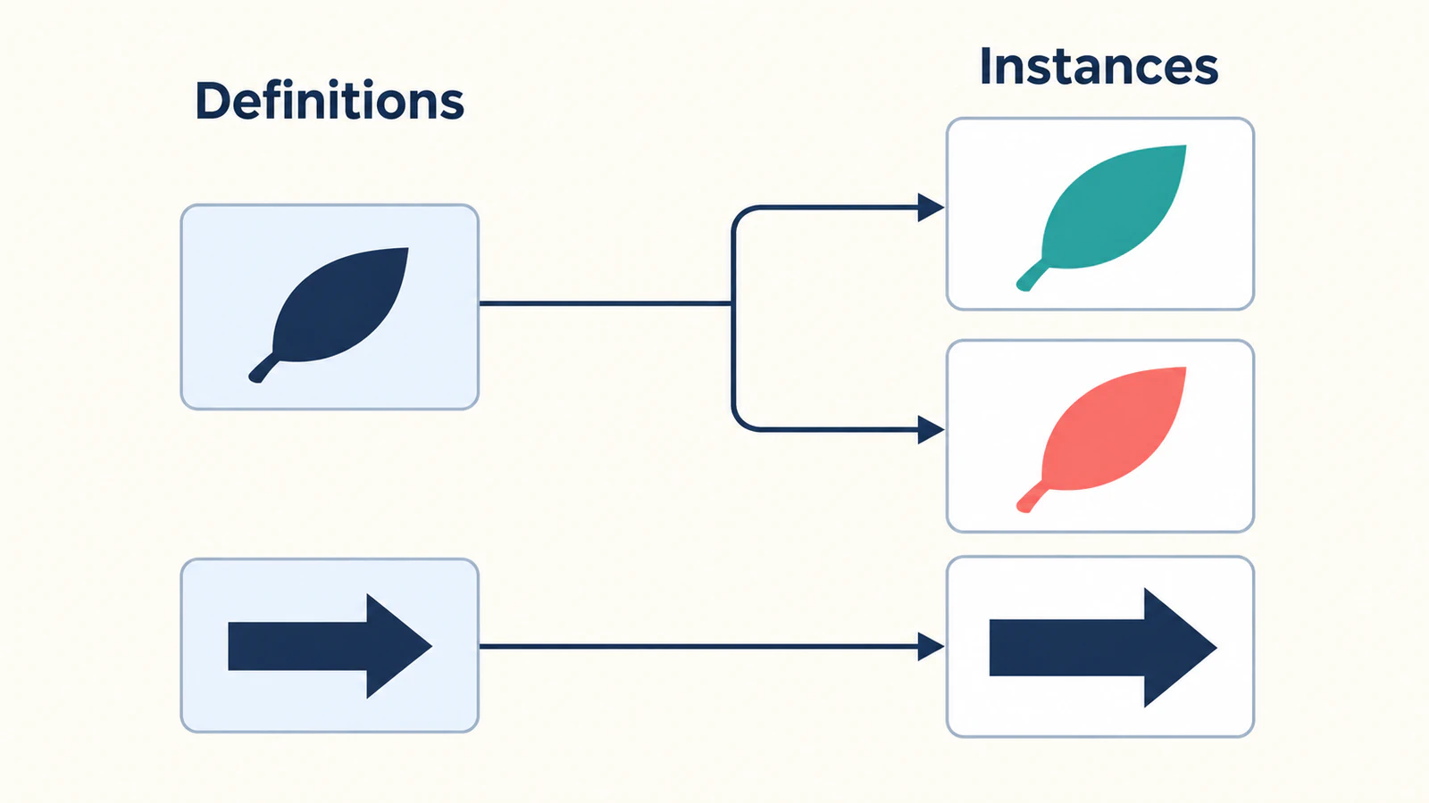
Reference the sprite from a page
Put sprite.svg, your HTML page, and icons.css in the same served directory. Start with a same-origin HTTP preview so that a local-file restriction or a different host does not obscure a basic reference error.
Add these rules to icons.css and load that stylesheet from the page:
.icon {
  display: inline-block;
  width: 1.5rem;
  height: 1.5rem;
  vertical-align: middle;
}
.icon-wide {
  width: 3rem;
}
.garden-button {
  display: inline-flex;
  align-items: center;
  gap: 0.5rem;
  color: #167d8d;
}
Then add these instances to the HTML body:
<button class="garden-button" type="button">
  <svg class="icon" aria-hidden="true" focusable="false">
    <use href="./sprite.svg#pv-leaf"></use>
  </svg>
  Garden
</button>

<svg class="icon icon-wide" role="img" aria-label="Right direction"
  style="color: #233b63">
  <use href="./sprite.svg#pv-arrow"></use>
</svg>
The part before # locates the file; the part after it selects the symbol. The modern attribute is href. MDN's use reference documents external references and warns that browsers may refuse cross-origin loads. Do not assume moving a working sprite to a CDN is a drop-in change; test the actual delivery location.
At the browser's default root font size, these rules give the leaf a 24 by 24 CSS-pixel box and the arrow a 48 by 24 box. The sizes use rem, so a different root font size changes them. Compare the icons inside the real component as well as in an enlarged preview: a correct box can still contain artwork with too much padding.
The button above demonstrates icon presentation and naming. Add the application's own action handler when using it in a product.
Choose the paint rule before combining files
Both example paths explicitly use fill="currentColor". This lets a consuming instance use the surrounding CSS color: the button supplies teal, while the arrow supplies navy. The color reference explains that currentColor can provide the value used by fills and strokes.
For the leaf's second appearance, use the same pv-leaf reference and change the instance's color to coral. Do not duplicate the path just to create another theme color.
| Artwork intent | Rule to preserve |
|---|---|
| One-color filled icon | Give its painted paths an explicit fill="currentColor" |
| One-color outline icon | Preserve the intended stroke and fill="none"; decide which stroke uses currentColor |
| Multicolor artwork | Keep the approved fixed fills or deliberately expose selected regions |
| Gradient artwork | Keep its paint definition and every reference to that definition together |
Do not replace every fill in a multicolor logo with currentColor. That discards the palette by design. If the file already changes color before sprite packaging, use the SVG color troubleshooting guide to isolate that earlier problem.
Also avoid building a sprite API around arbitrary page selectors reaching into referenced paths. MDN notes styling limitations for cloned content in use. Put the intended paint behavior into the source artwork and test the consumer.
Prevent duplicate IDs inside the artwork
Unique symbol names are necessary, but an exported SVG may contain more IDs inside it: gradients, masks, clip paths, or other referenced definitions. MDN requires each SVG id to be unique within its node tree. Two formerly separate files can violate that rule when combined.
For example, suppose a leaf export and a badge export both contain a gradient named paint0. Prefix the leaf's gradient ID and its matching reference together:
| Location in the leaf artwork | Before | After |
|---|---|---|
| Gradient definition | id="paint0" | id="pv-leaf-paint0" |
| Path using that gradient | fill="url(#paint0)" | fill="url(#pv-leaf-paint0)" |
The fragment must still point to the intended definition. MDN's fill examples show this relationship between a gradient ID and url(#...). Give the badge its own prefix rather than making both references point to the leaf's gradient.
Our two-path example has no nested definitions, which makes it a useful first check. For a real export, inventory all IDs and local references before combining files. After any optimizer or generator runs, repeat that inventory on the delivered sprite. Renaming only the outer symbol does not resolve duplicate internal IDs.
Name each visible instance in its context
The leaf beside the visible word “Garden” repeats information the button already provides. Its SVG uses aria-hidden="true", leaving the button's text to provide its name. Keep that attribute on the decorative SVG, not the interactive button. MDN's aria-hidden guidance covers decorative content and warns against hiding focusable elements.
The standalone arrow has a different role: it conveys direction without nearby text. Its outer SVG uses role="img" and aria-label="Right direction", following MDN's guidance for naming an embedded SVG image.
Decide the label at the point of use. A reusable leaf might mean “Garden,” “Plant-based,” or nothing beyond decoration in different interfaces. Test the final component's accessible name with the browser's accessibility inspection tools and your target assistive technology; a reusable symbol alone does not establish that context.
Check the delivered sprite, not only the source files
We checked this original example in a same-origin browser fixture. The leaf rendered in teal and coral, the wide arrow retained its shape, and a deliberately missing fragment produced an empty icon box. The browser's accessibility tree exposed the Garden button and the named arrow. That is a check of this fixture, not a cross-browser or screen-reader certification.
Use the same small set of checks after packaging:
- File: confirm the page loads the intended sprite from the final URL.
- Fragment: compare every
hreffragment with the delivered symbol ID, including capitalization. - Bounds: compare the small component and enlarged artwork for clipping, padding, and aspect ratio.
- Paint: render a one-color icon in two theme colors and inspect any artwork with fixed colors separately.
- Internal references: check that prefixed paint, mask, and clipping references still resolve after optimization.
- Meaning: inspect each interactive component's name and each meaningful standalone image's label.
If the file loads but a single instance is blank, check the fragment before changing the geometry. If the same artwork is blank as an ordinary SVG too, follow the broader blank SVG checks. If it looks pixelated when enlarged, inspect for an embedded raster image before assuming the sprite caused the problem.
When the only source is a PNG icon
If a simple icon survives only as a PNG, convert that PNG to SVG with PerfectVector before packaging it. Inspect the resulting silhouette, holes, and color regions against the source, then approve its coordinate bounds and paint rule. Finally, give the approved artwork stable IDs and add it to the sprite. Conversion supplies vector artwork; it does not choose your symbol names, component semantics, or delivery architecture.
If a clean original SVG exists, use it. Re-tracing it introduces another shape-recovery step without solving a broken fragment reference. Browse the SVG editing and preparation guides when the remaining problem is in the artwork rather than its packaging.
FAQ
Why is my SVG sprite blank when I open it directly? A sprite containing only symbol definitions does not directly display those symbols. Test it through an SVG use instance with the correct file path and fragment ID before treating the blank document as damaged artwork.
Does every symbol need the same viewBox? No. Preserve each approved coordinate system when packaging. Icons that share a design-system grid can use matching bounds, but a wide symbol does not become a square icon merely by changing its viewBox numbers.
Why does changing the page color not recolor my icon? Check the source paint rule. A fixed fill is different from a path authored with currentColor. Preserve intentional multicolor artwork and explicitly choose which fills or strokes should inherit the instance color.
Can I put the sprite on another domain? Do not assume an external use reference will work across origins. Start with a same-origin fixture, then test the actual host and browser targets before changing delivery. A successful local example does not establish cross-origin support.
Sources
- MDN — symbol — reusable definitions and indirect rendering.
- MDN — use — external fragments, styling limits, and origin restrictions.
- MDN — viewBox — the relationship between coordinate bounds and the viewport.
- MDN — color — currentColor as an input to SVG paint.
- MDN — id — identifier uniqueness within the document tree.
- MDN — fill — paint-server references such as gradient URLs.
- MDN — aria-hidden — decorative content and focusable-element cautions.
- MDN — img role — a labeled outer SVG for a meaningful image.
Start with two approved icons and test their names, bounds, and colors in the actual component. If one source exists only as a suitable raster image, recover its SVG paths, inspect the artwork, then add the accepted result to your sprite.
More from the blog

SVG in Qt: Choose the Renderer, Then Check the File
Use QSvgWidget or QSvgRenderer for SVG in Qt, check current feature support, and avoid confusing a scalable source with a fixed raster image in your app.

Godot SVG Import: Texture2D, DPITexture, and Sharp Icons
Fix blurry Godot SVG imports by choosing Texture2D or DPITexture. Check raster size, oversampling, supported artwork and icons at the scales your project needs.