
SVG Shadow Clipped? Check the Filter and Viewport
Fix a cropped SVG drop shadow by checking two separate boundaries: the filter region and the outer viewport. Follow a tested example before changing your paths.
On this page
A clipped SVG shadow can hit two different boundaries. The filter region limits where the effect is calculated; the SVG viewport or a parent container can then crop the rendered result. Increase the filter's region first. If the shadow still ends at the edge of the image, inspect the viewport and its clipping rules.
You do not need to retrace an SVG whose paths are already intact. This guide changes the effect's working area and the visible canvas while preserving the same original silhouette.
Diagnose the edge before changing the artwork
A straight edge close to the shape suggests a filter-region limit. An edge aligned with the SVG frame suggests viewport clipping. These are clues, not proof: a clip path, mask, or parent container can create the same symptom. Change one boundary at a time and compare the result.
Two boundaries, one unchanged path
We made a small silhouette by hand and opened three versions in a browser. Each uses the same path and feDropShadow settings: dx="22", dy="18", and stdDeviation="12". The capture below shows actual browser rendering, not a PerfectVector conversion.
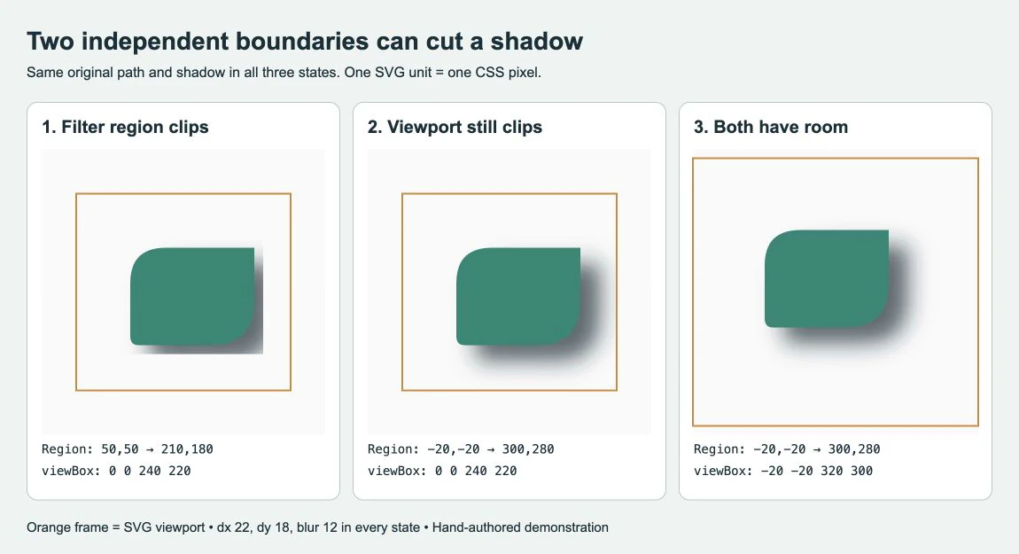
In the first version, the filter region runs from (50, 50) to (210, 180). That leaves a hard cutoff along the shadow's right and bottom edges. In the second, the region grows to cover (-20, -20) through (300, 280), but the SVG still shows only 0 0 240 220. The right edge of the shadow now reaches the viewport frame and gets cropped there.
The third version keeps the larger filter region and changes the viewBox to -20 -20 320 300. Its width and height also become 320 and 300, so all three demonstrations retain one SVG unit per CSS pixel. The extra space contains the visible shadow without resizing the path.
Expand the filter region in the right coordinate system
The <filter> attributes x, y, width, and height define its region. Their defaults are -10%, -10%, 120%, and 120%: some padding is already present, but it may be insufficient for a particular offset and blur. MDN documents these defaults.
Check filterUnits before changing the numbers:
objectBoundingBox, the default, interprets the region relative to the filtered element's bounding box. A percentage margin depends on the shape's dimensions.userSpaceOnUselets you define the region in the current user coordinate system of the element referencing the filter. It is useful when you know the artwork's coordinates.
Those rules apply to the region, as described in the filterUnits reference. They do not automatically change the shadow's offset or blur units.
primitiveUnits controls length values inside filter primitives. It defaults to userSpaceOnUse; we set it explicitly in the example so that 22, 18, and 12 retain that meaning. Switching it to objectBoundingBox would change how those values are interpreted. MDN separates primitive units from filter-region units.
For your own file, inspect the filtered object or group's bounds, then add enough room in the directions the shadow extends. The numbers below fit this demonstration. They are not a universal shadow margin. If you increase the blur, move the shadow, or transform the filtered group, check the result again.
Give the SVG viewport room too
Save this complete example as shadow.svg and open it in a browser. This is the exact SVG used for the third state, also checked as a standalone file:
<svg xmlns="http://www.w3.org/2000/svg" width="320" height="300" viewBox="-20 -20 320 300" overflow="hidden">
  <defs>
    <filter id="shadow" filterUnits="userSpaceOnUse"
      primitiveUnits="userSpaceOnUse" x="-20" y="-20" width="320" height="300">
      <feDropShadow dx="22" dy="18" stdDeviation="12"
        flood-color="#152b34" flood-opacity="0.7"/>
    </filter>
  </defs>
  <path d="M 60 160 L 60 100 Q 60 60 100 60 L 200 60 L 200 120 Q 200 170 150 170 L 70 170 Q 60 170 60 160 Z" fill="#078875" filter="url(#shadow)"/>
</svg>
The viewBox has four values: minimum x, minimum y, width, and height. It maps that rectangle of user coordinates to the SVG viewport. Increasing its dimensions while keeping the same displayed width and height makes the artwork appear smaller; it does not add layout space outside the element. MDN explains the viewBox mapping.
To reproduce the two failures, change only these values in a copy of the example:
- For the middle state, keep the filter unchanged but set the root
width="240",height="220", andviewBox="0 0 240 220". - For the first state, keep that smaller viewport and also set the filter to
x="50",y="50",width="160", andheight="130". - Restore the full example and compare the right and bottom edges. The path data never changes.
If your entire drawing is off-canvas, follow the broader blank SVG checks. If the drawing is visible but the dimensions change during import, inspect the relationship between SVG units and size before adjusting the geometry.
Why overflow can help inline SVG but miss the file problem
The example sets overflow="hidden" explicitly so its viewport boundary is reproducible. For an inline SVG, overflow="visible" can remove that viewport clip. It cannot recover pixels already discarded at the filter region, and an ancestor with its own clipping can still hide the result. CSS can also override the SVG presentation attribute. The SVG overflow reference describes these clipping rules.
Inspect the actual embedding route. An inline SVG on a roomy page, a standalone SVG, and an SVG loaded through an HTML image element do not provide the same surrounding layout. Our three-state capture uses image elements and gives the fixed file enough internal canvas space. Use that approach when the SVG must travel as a self-contained image: include the effect within its intended bounds, then reopen that exact file in its destination.
If it looks correct alone but clips inside a card, check the card's overflow, clipping, and masking. If it fails only in a particular editor or exporter, compare a simplified copy and consult that application's filter support. The SVG appearance-change guide covers that separate importer problem.
Preserve geometry and rebuild the effect separately
A rendered drop shadow adds an appearance to the path; it does not turn the blur into another editable contour. Keep an SVG master with the original geometry. For a cutting workflow, inspect the path outlines separately: the visible shadow is not an extra cut line.
If your source exists only as a PNG or JPG, PerfectVector can help recover SVG geometry before you add the effect. Convert the unshadowed artwork to vector, then inspect the outline, gaps, and unwanted background shapes in an editor. Add the shadow there and test its bounds using the checks above.
Use a source without the baked-in blur when one is available. Tracing a flattened image cannot restore the original filter settings or prove where the designer intended the clean silhouette to end. For a simple mark with no clean source, manual redraw may be the more controllable choice. The image vectorization overview explains what tracing reconstructs.
Check the delivered file
Open the exported SVG itself, not only the editor canvas. Confirm that the intended shadow fits at the final display size and that the output still contains the paths you need. Check the actual webpage or destination app as well, because a surrounding clip or unsupported filter can reintroduce the symptom.
Avoid leaving an enormous filter region as the default repair. A region far beyond the effect's needs makes the file harder to reason about; it also cannot fix an outer clipping boundary. Use a deliberate margin, keep the unfiltered source, and recheck after changing blur or offset.
FAQ
Why is the shadow still clipped after I increase the filter width? The SVG viewport, a parent container, a clip path, or a mask may impose another boundary. Check the filter's x and y as well as its width and height, then inspect where the remaining cutoff aligns.
Does filterUnits change the blur radius? filterUnits controls the filter region's coordinate system. primitiveUnits controls length values inside the filter primitives, including the shadow's offset and blur settings. Keep them separate when diagnosing the file.
Can I fix the clipping by vectorizing the SVG again? If the SVG already has usable paths, repair the filter region or viewport instead. Vectorization belongs upstream when the source is raster artwork; it does not recover the original shadow parameters.
Sources
- MDN: filter element — Defines the filter element and its default region padding.
- MDN: filterUnits — Explains bounding-box and user-space coordinates for the filter region.
- MDN: primitiveUnits — Distinguishes primitive lengths from the outer filter region.
- MDN: viewBox — Describes how user coordinates map to the visible SVG viewport.
- MDN: overflow — Documents viewport clipping, inline SVG defaults, and CSS precedence.
Starting with a raster-only silhouette? Prepare SVG paths with PerfectVector, inspect the recovered outline first, then add your shadow and reopen the final SVG to check both boundaries.
More from the blog

SVG Symbol Sprites: Keep IDs, ViewBoxes, and Colors
Build an SVG symbol sprite with two icons. Preserve IDs and viewBoxes, set color behavior, and check external references and accessible names in context.

Rhino SVG Import: Choose Curves, Hatches, or Surfaces
Choose the right Rhino 8 SVG import option, check object types and holes, and decide when a raster logo needs tracing before you start modeling the design.