Scan or Photograph Line Art Before Vectorizing?
Choose a scan or photo for line art by checking flatness, size, lighting, and detail. Compare capture with the original before turning pixels into SVG paths.
On this page
Try a flatbed scan when the drawing fits safely and lies flat. Photograph it when its size, binding, surface, or handling needs make scanning unsuitable. Then judge the actual image: intended lines should remain visible, gaps should stay open, the geometry should match the original, and paper shadows should not become part of the drawing.
Neither method wins by name alone. A clear photo can be more useful than a poor scan. If both methods are available, compare the same details in both captures before spending time on cleanup or vectorization.
Choose the capture method for this drawing
| Your original and goal | Method to try | What could change the decision |
|---|---|---|
| Loose, flat ink drawing that fits the available platen | Flatbed scan | Check the edges, faint marks, background, and any automatic adjustments |
| Oversized line drawing | Square-on photograph, or overlapping scans if handling permits | Compare the photograph's geometry with the work; inspect joins if assembling scans |
| Bound sketchbook or work that cannot lie flat comfortably | Supported photograph | Curved pages can still distort the drawing; choose a view and support that preserve its shape |
| Textured, painted, glossy, or mixed-media surface | Evaluate a photograph and the intended appearance first | Lighting can reveal or hide texture and produce glare; a flat vector trace may lose the reason for capturing it |
| Only a phone is available | Make a careful photo and inspect it | If corners or fine strokes fail the checks, recapture or use another digitization method |
| Original vector or editable digital drawing already exists | Use that original file | Scanning or photographing a print introduces an unnecessary reconstruction stage |
A platen is the scanner's flat capture surface. Fit means more than fitting inside its lid: the original must also tolerate the positioning involved. For a fragile or awkward original, choose a method that does not require forcing it flat.
FinerWorks' scan-versus-photo discussion identifies large artwork and sectional scanning as practical tradeoffs. It is an older, opinion-based comparison, not a current ranking of phone or scanner hardware. Its useful habit is to inspect the resulting image against the artwork.
Check geometry before contrast
Perspective distortion changes apparent proportions when a flat drawing is captured at an angle. A rectangular page can become a trapezoid, and the artwork inside it changes with the page. A known reference in the same plane helps reveal that problem.
For a photograph, aim square-on at the artwork and keep the camera's image plane parallel to it. Inspect all four corners and more than one edge. Liz Staley's firsthand phone-capture walkthrough discusses straight-on positioning and diffused light, then shows cleanup of her own photographed sketch. The principle is useful here; this guide does not reproduce her phone or application test.
Do not assume a rectangular crop repairs perspective. Cropping removes outer pixels; uniform resizing changes all lengths by the same factor. Neither operation makes unequal top and bottom reference lengths equal. A four-corner perspective correction may help with a flat planar original, but check the result against the drawing. Bowed paper and lens distortion need separate attention.
For an assembled scan, inspect a line crossing each join. Matching one landmark does not establish that every other segment aligns. Keep the source captures so a stitched copy can be compared or rebuilt.
What a synthetic example can establish
We authored a leaf motif inside a 240 × 240 reference square, then made two deliberate variants: a projective distortion and a dark-to-light background gradient. These are synthetic digital examples, not scanner or camera samples. No physical drawing, capture device, or PerfectVector conversion was tested.
The perspective variant maps the square's corners to (75, 45), (265, 65), (295, 285), and (35, 265). Inspection of the saved SVG found a top edge of approximately 191.05 digital units and a bottom edge of 260.77. Their ratio is about 1.3649. These numbers describe our chosen mapping, not the expected error from a phone.
Uniform resizing preserves that ratio. A sharp vector outline following those distorted boundaries could therefore remain distorted. Vectorization creates paths from pixels; geometric correction is a separate task that needs its own reference and verification.
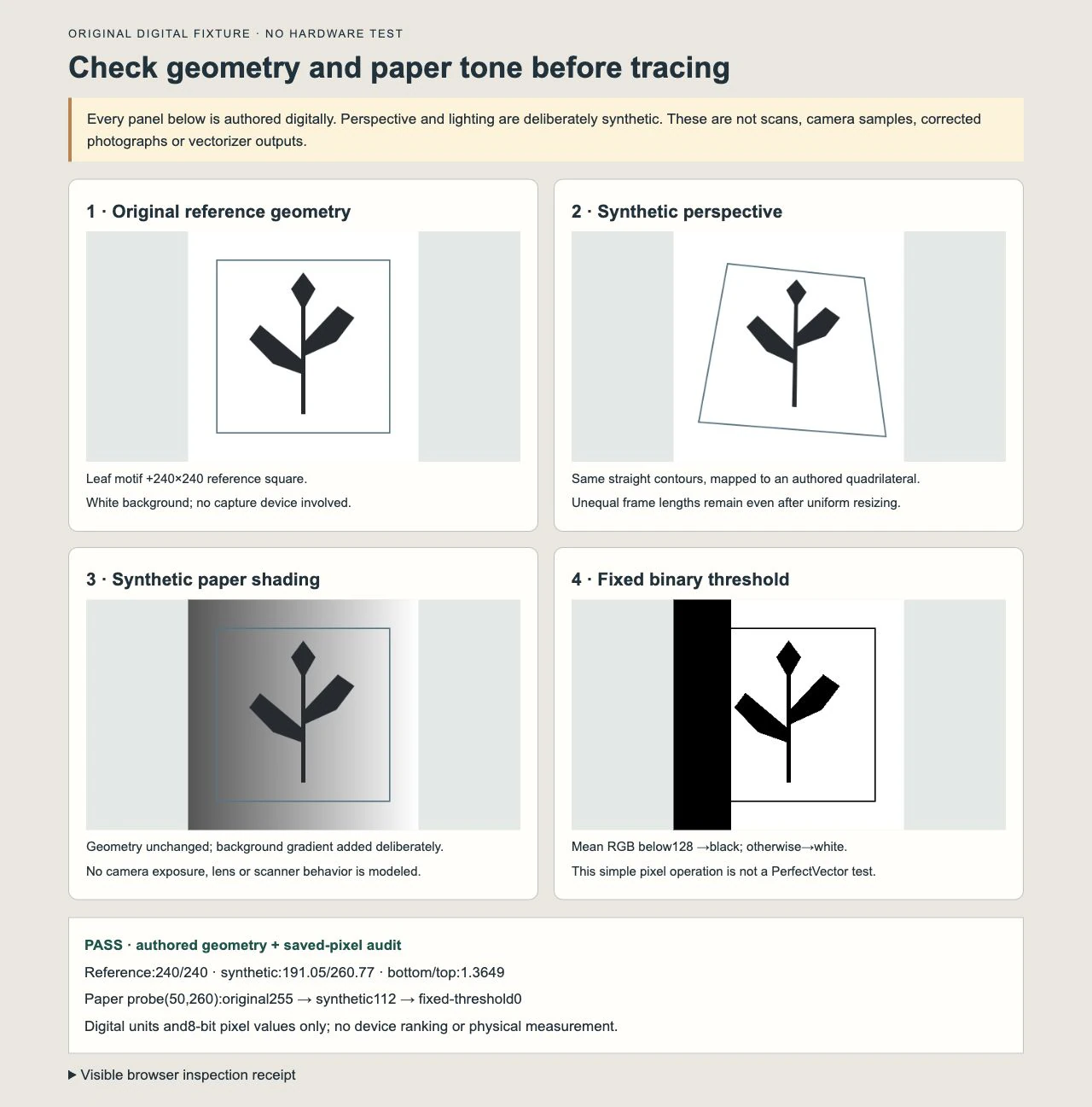
For the lighting example, we changed the background while keeping the motif geometry fixed. At a blank-paper probe, the saved image went from white 255 to gray 112 on an 8-bit scale. A simple binary operation assigned black to mean RGB values below 128 and white to the rest. That paper probe became black; a brighter paper probe at 223 stayed white.
This shows a specific failure of that fixed threshold: it classified deliberately shaded paper as dark content. It does not measure an AI vectorizer or establish that every cleanup method behaves the same way. Independent file inspection and browser decoding confirmed the saved example's lengths and pixel checks.
Check paper tone without erasing the drawing
Uneven lighting, glare, and faint lines are different problems. A dark paper region can compete with ink; a bright reflection can obscure it. Increasing contrast everywhere may hide one problem while deleting an intended pale stroke.
Compare the lightest meaningful line with a nearby blank area. If the two cannot be distinguished in the capture, do not treat a contrast slider as proof that the drawing has been recovered. Try another capture when the original is available, or redraw deliberately where faithful geometry matters.
Preserve an untouched capture with its tones before making a black-and-white working copy. The Library of Congress' scanning and tonal-resolution experiments illustrate how binary conversion can lose low-contrast information. Those historical experiments support the need to compare tonal detail; their old equipment and resolution settings are not recommendations for current devices.
Keep texture when it belongs to the art. Pencil grain, brush variation, paper tone, and washes may be the intended image. A cleaned raster can be the final asset when flat paths would change that appearance. For a TIFF working copy that does need tracing, follow the TIFF line-detail checks.
Compare real captures with a small repeatable test
Use this method on your own drawing before selecting a scan or photo:
- Keep the original and an untouched capture. Work on duplicates. If comparing both methods, use the same drawing and the same intended output size.
- Include a reference where appropriate. A known rectangle or measured span in the drawing's plane can expose proportion changes. A nearby object at a different height does not establish the page's geometry.
- Check the whole frame. Compare top and bottom spans, both sides, and an interior landmark against the original. A single correct measurement is not enough to prove the whole image.
- Inspect matched detail crops. Choose the thinnest intended line, smallest open gap, a sharp junction, and blank paper near both light and dark areas. Compare at the same displayed scale rather than fit-to-window sizes that differ.
- Make a working adjustment and compare again. Confirm that removing unwanted paper tone did not break a pale line, close a gap, or round a meaningful corner.
- Choose, recapture, or preserve the raster. Use the image that retains the required information. If neither capture does, change the setup or method before tracing.
The test is complete when you can identify which capture preserves the intended geometry and marks for your use, with the untouched source available for comparison. This is a proposed test for your real work; our reproduced measurements are limited to the synthetic fixture above.
A dimensions-critical pattern needs stronger checks than an illustration. The sewing-pattern digitization guide covers multiple measurements, calibration, and output verification for that separate task.
Trace after the capture passes
When the result is flat, readable line art and you need reusable worksheet or printable clipart, PerfectVector's clipart-to-SVG workflow can create candidate paths from the prepared image. Compare the preview with the chosen capture: check the silhouette, light lines, small gaps, corners, and unwanted paper shapes. Then check the downloaded SVG in its final layout.
A trace can follow a visible defect as well as an intended mark. It cannot establish the original dimensions from an arbitrary photograph or prove that an obscured line has been recovered. Preserve the scan or photo alongside the vector so those choices remain reviewable.
The line-art-to-SVG guide explains the next decision: filled outlines for reproducing visible ink versus a centerline workflow when a tool must follow a single stroke. Choosing a capture method does not choose that path structure for you.
FAQ
Is scanning always better than photographing line art? No. A flat drawing that fits safely is a good candidate for a scan. Large, bound, textured, or awkward work may favor a photograph or another capture approach. Judge the actual geometry and detail rather than assuming the method guarantees quality.
Can I photograph a drawing with a phone before vectorizing? Yes, if the resulting image preserves the intended lines and proportions. Use even light, photograph square-on where possible, and inspect the corners, gaps, and faint marks. No particular phone or camera app was tested in this guide.
Will converting the photo to SVG fix its perspective? Not by itself. Editable paths can retain the distorted boundaries visible in the source. Check and correct the source geometry separately, then verify the vector against the original or known references.
Should I use a black-and-white capture mode immediately? Keep a tonal original first. A binary working copy can suit bold ink, but inspect faint strokes and small gaps before accepting it. Our fixed-threshold example deliberately turned shaded background into black; it is a warning to inspect the result, not a recommendation for one universal threshold.
Sources
- FinerWorks — Scanning vs Photographing Artwork — Offers a print provider's practical discussion of artwork size, sectional scans, and inspection; its hardware opinions are dated.
- Liz Staley — Scanning Artwork using a Phone Camera — Demonstrates straight-on photo positioning, diffused light, and cleanup of the author's own artwork.
- Library of Congress — Scanning and Compression Experiments — Shows why reducing tonal information requires checks for lost low-contrast detail.
Have a capture that preserves the drawing and need reusable clipart paths? Create an SVG candidate, compare the fine lines and gaps with the source, and keep the untouched capture with your editable master.
More from the blog
Coloring Page Line Thickness: Check the Printed Size
Choose coloring-page line thickness at the final size. Compare stroke weights, preserve small coloring spaces, and check whether your SVG uses strokes or fills.
Turn a Child's Drawing Into an SVG (Wobble and All)
Turn your kid's drawing into an SVG for shirts, ornaments, and cards: photograph it right, handle crayon and marker, and keep the wobble that makes it theirs.