
Wrap HTML Text Around an SVG Shape with CSS Floats
Wrap an HTML paragraph around a transparent SVG with CSS shape-outside. Reproduce a working float example and check two widths, alpha, and text order.
On this page
- Choose the text layout you actually need
- 1. Give the float a size and a transparent image
- 2. Run the complete HTML example
- 3. Check the rendered rows at more than one width
- 4. Treat shape margin, alpha, and loading separately
- 5. Preserve text order and check the finished page
- Fix the symptom at its source
- FAQ
- Sources
To wrap HTML text around an SVG silhouette, float the image, give it explicit dimensions, and set shape-outside to the transparent SVG's URL. Add shape-margin for space around the contour. The paragraph stays ordinary HTML; the SVG supplies the image used to calculate its wrapping boundary.
This works outside the SVG. It does not wrap an SVG text element or bend letters along a path. The example below uses an original transparent silhouette and a complete paragraph, with no manually positioned words or inserted line breaks.
Choose the text layout you actually need
| Intended result | Appropriate starting point |
|---|---|
| A page paragraph flows beside an irregular illustration | A floated image with CSS shape-outside, as shown here |
| A multiline label stays within an SVG width | SVG text wrapping with tspan |
| Rich HTML content lives inside an SVG region | HTML inside SVG with foreignObject |
| Letters follow a curved baseline | SVG text on a path |
The SVG file does not carry the surrounding paragraph layout. Copying the image into another document will not transfer this HTML/CSS relationship.
1. Give the float a size and a transparent image
MDN's shape-outside reference describes the property as a way to change the float area around which adjacent inline content wraps. With the default value, that area follows the float's margin box. An image URL instead derives the shape from image alpha, meaning transparency.
The visible color is not the boundary signal. An opaque white background still has alpha and can make an illustration behave like a rectangle. Check the file itself, not just how white artwork looks on a white page. Preserve transparency outside the silhouette.
Save this original artwork as silhouette.svg:
<svg xmlns="http://www.w3.org/2000/svg" width="150" height="180" viewBox="0 0 150 180">
  <path fill="#2f6977" d="M30 20 C80 5 135 35 138 75 C140 110 105 140 65 150 L45 170 L37 142 C8 125 8 85 22 62 C10 47 16 31 30 20 Z"/>
</svg>
Its intrinsic size is 150 × 180, and the CSS uses the same width and height. Keeping the aspect ratio consistent makes the relationship between the displayed art and the shape image easy to inspect.
The image in this example is decorative, so it has an empty alt attribute. Give a meaningful image an appropriate text alternative for your page; wrapping around it does not communicate its meaning automatically.
2. Run the complete HTML example
Save this as index.html beside silhouette.svg:
<!doctype html>
<html lang="en">
<meta charset="utf-8">
<title>HTML text around an SVG silhouette</title>
<style>
* { box-sizing: border-box; }
.sample {
  display: flow-root;
  color: #183a42;
  font: 16px/24px Arial, sans-serif;
}
.sample p { margin: 0; }
.sample img { float: left; width: 150px; height: 180px; margin: 0; }
.sample.narrow { width: 360px; }
.sample.wide { width: 520px; }
.sample.contour img {
  shape-outside: url("silhouette.svg");
  shape-image-threshold: 0.5;
  shape-margin: 10px;
}
</style>
<div class="sample narrow contour">
  <img src="silhouette.svg" alt="">
  <p>The neighborhood library keeps a small garden beside its reading room. Volunteers label the seedlings, share spare pots, and record which plants attract insects. A curved illustration can sit beside this paragraph while the browser keeps the words in their original order. As the column becomes narrower, the same sentence needs different line breaks. The artwork remains the same size in this example, so the available room beside it changes. After the illustration ends, the paragraph can use the full column again. Editors can revise this text without moving individual words or drawing separate text lines. The layout belongs to the web page, while the SVG supplies the visible silhouette.</p>
</div>
</html>
Serve the folder over HTTP, for example with python -m http.server 8000, and open http://localhost:8000/index.html. The two files then share the same origin. A local file URL is not the loading setup tested here.
Change class="sample narrow contour" to class="sample narrow" to compare normal rectangular float wrapping. Change narrow to wide to test the 520-pixel column. The paragraph and image remain unchanged.
The display reference describes flow-root as establishing a block formatting context. Here it contains the floated image within its sample. It does not position the words; the browser's inline layout does that.
3. Check the rendered rows at more than one width
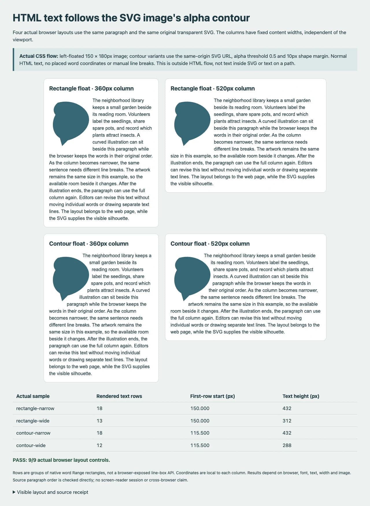
We ran four visible samples in Chromium 155 using Arial at 16px with a 24px line height. The image stayed 150 × 180px while the columns had fixed content widths of 360px and 520px. Both contour samples used shape-margin: 10px and shape-image-threshold: 0.5.
| Actual sample | Rendered text rows | First-row start | Text height |
|---|---|---|---|
| rectangle-narrow | 18 | 150px | 432px |
| rectangle-wide | 13 | 150px | 312px |
| contour-narrow | 18 | 115.5px | 432px |
| contour-wide | 12 | 115.5px | 288px |
The narrow contour changed the wrapping without reducing the total row count. At the wider width, the contour sample used one fewer row than its rectangular control.
We measured native DOM Range rectangles for each word and grouped them by vertical position. Those are rendered text-row measurements, not access to a browser's internal line-box objects. We also checked the computed float and shape settings, the loaded image dimensions, and alpha samples in the actual SVG image.
At both widths, some contour rows began to the left of the rectangular float's 150px exclusion edge. Text also returned to the full column after the image. These observations show that the tested contour affected real layout, rather than merely changing how a screenshot looked.
The exact rows and coordinates depend on the font, browser, paragraph, image, and width. Replacing a sentence or loading another font can change them. Test your actual content at narrow and wide sizes instead of preserving these numbers as design constants.
4. Treat shape margin, alpha, and loading separately
shape-margin expands the wrapping shape to make room between it and the text. The 10px value here is a layout choice, not a measured minimum gap between every visible glyph and every point on the illustration.
The CSS Shapes specification keeps the normal box model in place and clips the shape's effect to the float's margin box. A large shape margin does not give the image a larger CSS box. If your design needs more room, inspect the float's dimensions and ordinary margins as well.
shape-image-threshold chooses the alpha threshold used to extract the image shape. The original fixture has a fully transparent exterior and opaque central artwork. Soft shadows or translucent edges need a deliberate threshold choice and visual review; changing the threshold cannot make an opaque background transparent.
The image URL must also be eligible for shape loading. CSS Shapes specifies a CORS request for image URLs and falls back to no custom shape when loading fails. Serving the SVG beside the page avoids a cross-origin dependency in this example. If a CDN hosts it, configure that server's CORS response and inspect the request and layout. Seeing the image in an img element alone does not establish that the shape request succeeded.
5. Preserve text order and check the finished page
All four tested paragraphs kept exactly the same text in one text node, with no br elements or per-word positioning. CSS changed the visual line breaks without rewriting the paragraph's DOM order. We did not run a screen-reader session or claim an accessibility audit from that source check.
Keep the paragraph readable when the image is unavailable or the layout changes. For very narrow columns, a simpler arrangement with the image above the paragraph may be easier to read than a thin strip of text beside it. Check your own breakpoint and content rather than shrinking the text to force a contour effect.
The float still reserves a CSS box. Shape wrapping does not turn it into a general obstacle that text flows around on every side. In this left-float example, the adjacent text wraps on the right and then continues below.
Fix the symptom at its source
| Symptom | Check and recovery |
|---|---|
| Text follows a rectangle | Confirm that float is active, dimensions are defined, the shape URL loaded, and the source has transparent surroundings. |
| Text overlaps the visible illustration | Compare the displayed SVG and shape URL, their dimensions, and their aspect ratios. Inspect the alpha threshold and shape margin. |
| The image appears but the contour does not | Inspect the shape image request and CORS behavior separately from the img request. Test the same-origin example before adding a CDN. |
| A child in flex or grid does not float as expected | Keep the float and paragraph in a normal flow container, as in this example, rather than making the floated image itself a flex or grid item. |
| A narrow paragraph becomes hard to read | Reduce the image size or move it above the text at an appropriate breakpoint, then test the actual paragraph again. |
| SVG labels still do not wrap | Use the inside-SVG text workflow from the table above. Shape-outside changes adjacent HTML flow, not SVG text layout. |
If a suitable flat illustration survives only as a raster image and you need editable silhouette artwork, PerfectVector's clipart to SVG workflow can help recover a candidate. Compare its outline and transparent surroundings with the source, then test the actual SVG URL in your page. A transparent raster image can also supply an image-based CSS shape; SVG is not required merely to activate alpha wrapping.
Keep a clean existing SVG when you have one. Vectorization does not build the surrounding HTML layout, preserve paragraph semantics for you, or guarantee a particular browser's wrapping result.
FAQ
Does shape-outside wrap text inside an SVG? No. This example changes HTML inline flow beside a floated image. SVG labels, HTML embedded inside SVG, and text following a path are different layout tasks.
Why does my transparent-looking SVG still wrap as a rectangle? Check for an opaque background in the file, a failed shape image request, missing float sizing, or a layout context where float is inactive. White pixels are not the same as transparent pixels.
Do I need to convert a PNG to SVG first? Not just for alpha-based wrapping. A suitable transparent raster image can provide the shape too. Use SVG when editable artwork or other vector requirements justify it.
Will the line breaks stay the same at every screen size? No. Available width, font metrics, text, image size, and browser layout affect the rows. Test the actual content at more than one width.
Sources
- MDN shape-outside — Documents float areas and alpha-derived image shapes.
- MDN shape-margin — Defines spacing added around the wrapping shape.
- MDN shape-image-threshold — Defines the alpha threshold used for image shapes.
- CSS Shapes Module Level 1 — Specifies float-box limits, image loading, and CORS behavior.
- MDN display and flow-root — Explains the formatting context used to contain the float.
If editable artwork is missing, prepare a clipart SVG candidate, inspect its silhouette and transparency, and verify the real paragraph layout in your page at the widths you intend to support.
More from the blog
SVG textLength: Fit a Label Without Distorting the Letters
Compare SVG textLength spacing and spacingAndGlyphs with real label examples. Preserve letter shapes, handle a maximum width, and keep your wording editable.
SVG Text Vertical Alignment: Center a Rebuilt Label
Align SVG labels with dominant-baseline, compare middle and central in two fonts, and distinguish text-box centering from the visible shape of the letters.