
SVG in SwiftUI: Add Assets and Control Their Color
Add an SVG to an Xcode image set, load it by asset name, and choose original or template rendering. Check color, spacing, and the delivered app at its real size.
On this page
- Choose the route for this particular image
- Prepare a small source with visible checks
- Add it as an ordinary image set
- Compare original and template rendering
- Diagnose the visible result before changing the file
- Keep runtime SVG and SF Symbols as separate decisions
- When your icon exists only as a PNG
- FAQ
- Sources
For a static SVG included with your SwiftUI app, put the artwork in an Xcode asset catalog and load the image by its asset name. Then decide whether it should keep its original colors or become a tinted silhouette. Apple added SVG image assets in Xcode 12; its release notes identify vector preservation for deployment targets of iOS 13, iPadOS 13, and macOS 10.15 or later.
That catalog workflow is different from downloading an SVG file while the app is running. It is also different from creating a custom SF Symbol. Choose the delivery route before changing the artwork or adding a renderer package.
Choose the route for this particular image
An SVG is the source file. The way your app receives and uses it determines the next step.
| What you need | Starting route | What to verify |
|---|---|---|
| A bundled static logo or illustration | An ordinary image set in the asset catalog | Asset name, colors, bounds, and build output |
| An SVG file supplied at runtime | An explicit SVG rendering solution | The renderer's supported features and your loading/error behavior |
| A shape whose geometry you control in SwiftUI | Native Shape/Path code | Path translation, proportions, and styling |
| A custom symbol with text-like weights and alignment | The SF Symbols template workflow | Required variants, guides, annotations, and validation |
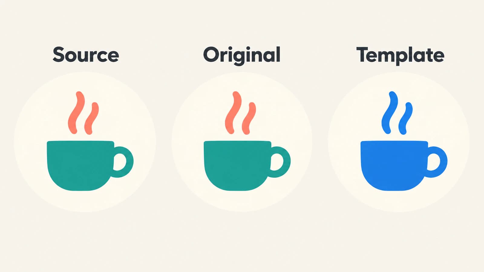
This walkthrough uses the first route. A small two-color cup makes two separate mistakes easy to notice: losing the coral steam color and filling the open handle. Neither requires a complicated illustration to diagnose.
The UI-kit preparation guide covers the broader work of making a set consistent. Here, the question is how one accepted SVG reaches a SwiftUI Image.
Prepare a small source with visible checks
Save this original example as CupMark.svg:
<svg xmlns="http://www.w3.org/2000/svg" viewBox="0 0 64 64">
  <path d="M12 26H43V45Q43 54 34 54H21Q12 54 12 45Z"
    fill="#147D73"/>
  <path d="M43 30H48Q55 30 55 37Q55 44 48 44H43"
    fill="none" stroke="#147D73" stroke-width="5"/>
  <path d="M24 19Q18 14 25 8M35 19Q29 14 36 8"
    fill="none" stroke="#EB8067" stroke-width="4" stroke-linecap="round"/>
</svg>
The cup is teal, the two steam strokes are coral, and the area inside the handle is empty. Keep those three properties on your review list. The SVG contains no text, external image, filter, or script, so it gives you a compact starting file for a catalog experiment.
For your own artwork, inspect the source before import. Excessive empty canvas makes an icon look small even when its view has the right dimensions. A white background rectangle becomes part of a template silhouette. An embedded photograph remains a different kind of content from the paths around it; the embedded-raster check helps distinguish them.
Keep the editable master outside the app's delivery copy. If the icon contains lettering, resolve the intended font or outline strategy in the master; see the SVG font-change workflow. Changing a SwiftUI text style is not a substitute for checking lettering inside an image.
Add it as an ordinary image set
Open the app's asset catalog, commonly Assets.xcassets. Add a new image set and name it CupMark. Drag the SVG into the appropriate image well. Apple's asset-catalog guide describes creating sets, importing resources, and providing variations through the Attributes inspector.
Use an image set for this example. Do not select a symbol-image workflow merely because the source ends in .svg.
After import, check the catalog preview and any build diagnostics. Confirm that the catalog belongs to the app target that will use it. If your asset setup contains platform or appearance variations, make sure the intended image is present in the relevant configuration rather than assuming the preview represents every configuration.
The name CupMark is the image resource name used below. It is not a download URL or a path to the original SVG in your design folder. Apple's Image initializer looks up a resource by name in a bundle; its default is the main bundle. If your image belongs to another resource bundle, supply that bundle deliberately.
Preserve the filename and asset-name distinction in the handoff notes. A teammate can rename the asset set without changing the original design filename, and the code must follow the resource name it actually loads.
Compare original and template rendering
Use this view after adding the CupMark image set:
import SwiftUI

struct CupComparison: View {
    var body: some View {
        HStack(spacing: 24) {
            Image("CupMark")
                .renderingMode(.original)
                .resizable()
                .scaledToFit()
                .frame(width: 48, height: 48)
                .accessibilityLabel("Cup with rising steam")

            Image("CupMark")
                .renderingMode(.template)
                .resizable()
                .scaledToFit()
                .frame(width: 48, height: 48)
                .foregroundStyle(Color.blue)
                .accessibilityLabel("Cup with rising steam")
        }
        .padding()
    }
}
The left instance explicitly asks for original rendering. The right instance asks for template rendering and supplies blue as the foreground style. Apple's template-rendering documentation defines template mode in terms of non-transparent pixels taking the foreground color. It is a silhouette treatment, not a command to recolor just one SVG path.
For the cup, that means the right-hand version should have blue steam and a blue cup. The coral/teal distinction is intentionally gone. The handle opening should remain empty. If your app needs the steam to change independently from the cup, choose a delivery structure that exposes those parts separately instead of expecting one template image to provide per-path styling.
The modifiers also make the sizing decision explicit. resizable() enables the image's resizing behavior, and scaledToFit() preserves its aspect ratio inside the 48-point frame. A view frame and the artwork's own canvas are separate boundaries: extra whitespace inside the SVG is still part of the source.
This is a documented example to try in your project, not a reported native rendering test. Check the actual built app, including the smallest size at which you plan to use the mark. A clear 48-point preview does not establish that both steam strokes will remain useful at 16 points.
Diagnose the visible result before changing the file
A missing image, a changed color, and a poor small-size silhouette call for different fixes.
| Symptom | First check | Useful next action |
|---|---|---|
| No image appears | Resource name, bundle, target, and catalog build diagnostics | Resolve lookup or import before editing paths |
| Every part takes one color | Original versus template rendering | Use original for fixed multicolor artwork |
| Tint fills a large rectangle | An opaque background in the source | Remove unintended background geometry in the master |
| The mark looks too small | Empty area inside the SVG canvas | Correct the canvas, then re-export |
| Steam or a narrow opening is unclear | Final display size and source detail | Simplify deliberately and review the smaller version |
| A feature differs from the design editor | The specific SVG feature and importer diagnostics | Test a simpler delivery copy or choose another supported format |
Change one layer at a time. If the source already has the correct opening, rebuilding the trace will not fix a misspelled asset name. If the lookup works but template mode removes color distinctions, adding more colors to the SVG will not change the selected rendering mode.
For an icon beside visible text, review its accessible name in the control's full context. The example supplies a description for each comparison image. A decorative repeat beside an already named control may need a different accessibility treatment; do not ship the comparison view's labels mechanically in every placement.
Keep runtime SVG and SF Symbols as separate decisions
A named catalog image is not an API for fetching and parsing arbitrary SVG XML. If the file arrives after the app is built, choose a renderer that explicitly handles that input. For example, the SVGView project README describes an SVG parser and renderer written in SwiftUI. Evaluate the actual SVG features your files use; a package's goal of broad support is not proof that your entire input set renders correctly.
Keep loading, failure, and unsupported-file behavior part of that runtime feature. Do not add a package solely because an older answer says SwiftUI cannot use SVG images, when your need is a static image already covered by the asset-catalog route.
Custom SF Symbols have a different source contract. Apple documents a template-based creation and validation workflow, including symbol variants and alignment information. An ordinary cup SVG does not acquire those properties by being placed in an image set. Use that workflow when the app needs symbol behavior, and retain its required template structure.
Platform delivery formats are worth checking independently. If the same artwork is also headed to Android, follow the VectorDrawable handoff guide; acceptance by one platform's importer does not prove acceptance by another.
When your icon exists only as a PNG
If the editable source is missing and the PNG is a simple icon, PerfectVector's PNG-to-SVG converter can help prepare an artwork candidate for this workflow. Crop to the icon, inspect its preview for lost openings, merged details, and unwanted background shapes, then compare it with the original. Download the accepted SVG and test it through the same image-set and rendering-mode checks.
Use the original vector when it exists. Keep photographs and effect-heavy imagery raster when that better preserves their appearance. Vectorization prepares geometry; it does not compile the Xcode catalog, choose your resource bundle, or produce an SF Symbols template with the required variants.
Before handing over the asset, record its catalog name, intended original/template behavior, minimum visual size, and the source file used to regenerate it. Test light and dark backgrounds and any supported appearance variations in the app. The blog's artwork guides cover the source preparation that comes before this delivery step.
FAQ
Can SwiftUI use an SVG from an asset catalog? Yes. Xcode supports SVG image assets. Add the file to an ordinary image set and load the named resource with Image. Verify the deployment target and actual catalog build rather than treating this as support for arbitrary runtime SVG files.
Why did my SVG become one color? Check the rendering mode. Template rendering uses the visible image as a foreground-colored silhouette. Use original rendering when you need the artwork's original color distinctions.
Can Image load an SVG from a web URL? The named Image initializer is a resource lookup, not a URL-based SVG parser. Runtime SVG files require a suitable rendering and loading workflow that you verify with your actual inputs.
Is an SVG image set the same as a custom SF Symbol? No. Custom symbols use a template with required structure, variants, alignment information, and validation. A normal SVG image set does not automatically provide those symbol properties.
Sources
- Apple — Xcode 12 Release Notes — SVG image-asset support and documented vector-preservation deployment targets.
- Apple — Managing assets with asset catalogs — asset sets, import wells, and variations.
- Apple — Image init(_:bundle:) — named resource and bundle lookup.
- Apple — Image.TemplateRenderingMode — original and template rendering modes.
- Apple — resizable(capInsets:resizingMode:) — explicit image resizing behavior.
- Apple — scaledToFit() — fitting while preserving aspect ratio.
- Apple — Creating custom symbol images for your app — custom-symbol templates, variants, and validation.
- Exyte — SVGView — a separate SVG parsing and rendering solution for SwiftUI.
Check one icon in its intended size and color mode before importing the set. If only a PNG remains, prepare an SVG candidate, inspect its openings and background, and verify the accepted file in the built app.
More from the blog

Flutter SVG Images: Bundle, Size, and Check Assets
Add an SVG asset to Flutter, match its bundle path, set widget dimensions, and check colours and semantics. Separate loading problems from unsupported artwork.

SVG in WPF: Choose a Renderer or a XAML Drawing
Use SVG artwork in WPF with a renderer, a native DrawingImage, or a PNG export. Follow an original icon example and check bounds, colors, and dependencies.