Scientific Figures: Keep Meaning Without Color
Check scientific diagrams in grayscale with labels, shapes, and line styles. Use a complete SVG example to preserve condition identity without changing data.
On this page
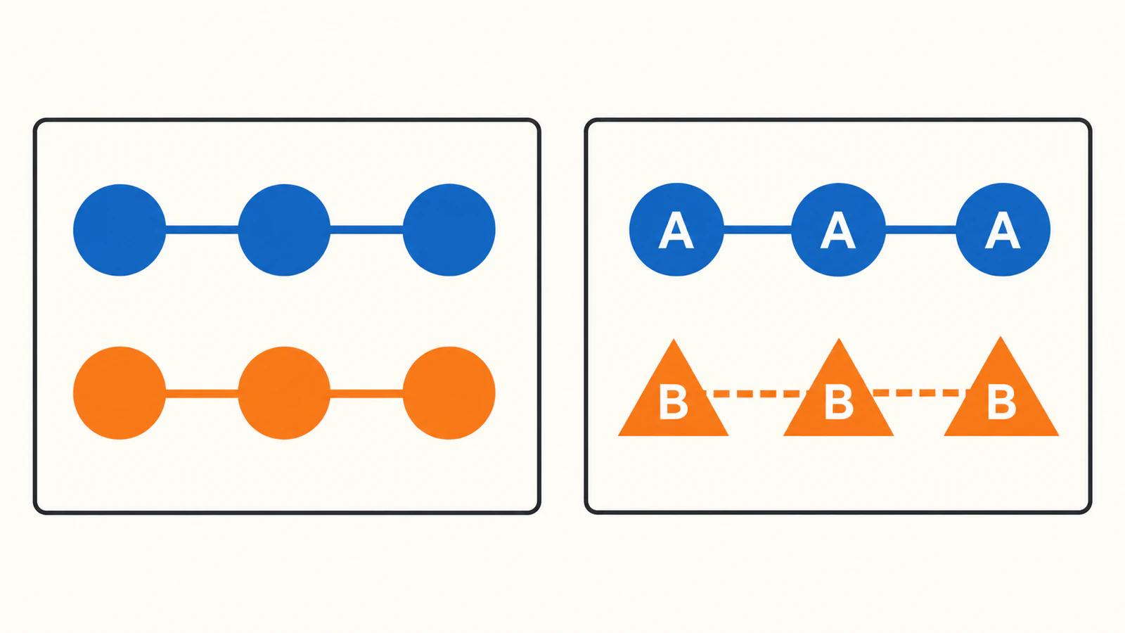
For a scientific diagram to work without color, give each important condition a visible identity beyond its hue. Add direct labels, distinguish suitable symbols or line styles, then inspect a grayscale copy at the intended display size. A different palette can help, but it cannot name an unlabeled condition.
This guide covers categorical explanatory diagrams: a schematic showing two conditions, groups, or routes. It uses an original two-row SVG (Scalable Vector Graphics) file with no experimental data. Continuous heatmaps, micrographs, and measured plots need their own data-aware treatment; do not trace their marks into new shapes to make them look clearer.
Decide what the color is telling the reader
Start with the editable source, the figure legend, and the smallest intended reproduction. List the distinctions the reader must recover: which condition a symbol belongs to, where a route leads, or which panel a label describes.
Then hide the color mentally. If the instructions become “follow the orange line” or “compare the blue circles,” replace that dependency with names the reader can locate in the figure. Use meaningful condition names in a real submission. “Condition A” and “Condition B” below are placeholders for demonstrating the layout.
The W3C's guidance on using color calls for a visible cue such as text or shape when color carries information. It is web accessibility guidance, not a scientific journal's acceptance test. The same design principle is useful here: preserve the distinction through another cue.
Give each condition a second identity
Use the fewest cues that make the mapping clear. A short label beside each route may be enough for a simple schematic. Repeated markers or different connector styles can help the reader follow a longer route without returning to a legend.
| Condition | Color in this example | Symbol | Connector | Direct label |
|---|---|---|---|---|
| A | Blue | Circle | Solid | Condition A |
| B | Orange | Triangle | Dashed | Condition B |
Keep that mapping consistent across panels. If a triangle already means a particular component in your field, preserve that meaning and choose another cue. Likewise, do not repurpose a dashed line that already signifies a hypothetical connection. Redundant encoding means expressing the same identity through more than one cue; it does not mean assigning conflicting meanings to familiar symbols.
Choose a palette appropriate to your target, and keep labels readable against the background. Nature's figure specifications ask for an accessible palette and show colored legend boxes paired with black text. They also discourage patterns and decorative clutter. That supports using plain labels and purposeful symbols rather than filling every object with hatching.
Try the two-condition SVG
Save this complete example as conditions.svg. Open it in a browser or vector editor. It has a white background, two labeled rows, and no external images or imported fonts. The different symbols are deliberately generic; they do not represent a biological mechanism.
<svg xmlns="http://www.w3.org/2000/svg" width="600" height="240" viewBox="0 0 600 240">
  <rect width="600" height="240" fill="white"/>
  <g fill="white" stroke-width="4">
    <g stroke="#0072B2">
      <path d="M80 70H320"/>
      <circle cx="80" cy="70" r="16"/><circle cx="320" cy="70" r="16"/>
    </g>
    <g stroke="#D55E00">
      <path d="M80 170H320" stroke-dasharray="12 8"/>
      <polygon points="80,150 62,180 98,180"/><polygon points="320,150 302,180 338,180"/>
    </g>
  </g>
  <g fill="black" font-family="sans-serif" font-size="24">
    <text x="370" y="78">Condition A</text>
    <text x="370" y="178">Condition B</text>
  </g>
</svg>
The source keeps the labels as text. Its stroke-dasharray="12 8" gives the lower connector a repeating dash-and-gap pattern; SVG's stroke-dashing specification defines how those lengths follow the path. Neither the label nor the triangle depends on recognizing orange.
- Open the 600 × 240 version. Confirm that both labels are present, the circles belong to A, and the triangles belong to B.
- Export a color copy, then make a grayscale copy of that export. Keep the color master. Check whether you can identify both conditions by name and follow their connectors without consulting a color description.
- Make a smaller source copy with
width="300"andheight="120", leaving theviewBoxunchanged. Repeat both exports. This checks one reduction, not a universal minimum size. - Inspect the file you will actually place in the manuscript or slide. Confirm that the labels, symbols, and connector styles survive that export and any subsequent resizing.
For a deliberately weaker control, remove the text group, replace the triangles with circles in the same positions, and remove stroke-dasharray. It still has two colored rows. The question is whether their condition names remain available, not whether the two gray tones happen to look identical.
We rendered both versions with librsvg at 600 × 240 and 300 × 120 pixels, then converted each output to grayscale with the RGB weighting 0.299R + 0.587G + 0.114B. In all four redundant versions, the labels, circle/triangle distinction, and solid/dashed connectors remained visible and unclipped. The control's blue and orange became different gray values, 87 and 119 on a 0–255 scale. We therefore do not describe the control as indistinguishable. The improvement is explicit condition identity that does not depend on hue.
These are digital checks of this authored SVG. We did not test a physical print or run a study with readers. A grayscale conversion also does not reproduce every form of color vision deficiency. Treat it as one inspection view, alongside checks appropriate to your audience and journal.
Repair the cue that fails at the final size
If a label becomes too small, shorten it carefully or make room for larger text. If dashes merge into an apparently solid line, revise the dash spacing or use a different suitable cue. If a marker loses its shape, simplify it or increase its size. Recheck the full figure after each change so the repair does not create overlap elsewhere.
For physical-size calculations, use the separate guide to scientific figure font size and line width. This article's 300-pixel example is a screen-render check, not a journal column-width recommendation.
Keep the legend synchronized with the artwork. Replace “orange line” with a condition name and its visible cue, such as “Condition B, dashed connector.” For online figures, also provide an appropriate text alternative or caption describing the substantive comparison. Visible labels alone do not establish accessibility for people who cannot see the figure.
Preserve the science while editing the presentation
Revise measured plots in their plotting source and re-export them with the underlying values intact. For micrographs, keep the original images and follow the journal's image-processing rules. Nature's image-integrity policy requires the final image to represent the original data accurately and describes disclosure requirements for processing. Redrawing an image until it looks tidier is not a substitute for that workflow.
If a separate raster schematic is all you have, PerfectVector's scientific diagram to SVG workflow can help recover editable shapes. Check the preview, then unlock the result for SVG editing and export. Compare every recovered connection and symbol with the source, and rebuild labels as text where needed. A recovered shape is useful only if its scientific meaning survives. If you already have editable artwork, revise it directly; changing SVG colors covers that narrower editing step.
Finish when each condition has an unambiguous name, its noncolor cues remain readable in the placed figure, and the legend agrees. If missing vector source is blocking a separate schematic, recover its shapes with PerfectVector, then repeat this identity check on the exported result.
FAQ
Is a colorblind-friendly palette enough for a scientific diagram? A suitable palette helps, but condition identity should also be available through direct labels or other appropriate cues. Check the complete figure at its intended size, including the legend.
Does a grayscale check prove that a figure is accessible? No. It checks one rendering without hue. It does not cover every color vision difference, low vision, screen-reader access, or the requirements of a particular journal.
Should I change all my scientific symbols to circles and triangles? No. The example uses generic placeholders. Preserve symbols and line styles that already have scientific meanings, and add labels or another compatible cue.
Sources
- W3C — Understanding Use of Color — Explains visible alternatives to color and the limits of this accessibility criterion.
- Nature — Preparing figures: our specifications — Provides the cited palette, legend-text, and clutter guidance for Nature figures.
- W3C — SVG stroke dashing — Defines the dash-and-gap pattern used by the complete source example.
- Nature — Image integrity and standards — Sets the source-data and processing boundaries behind the scientific-image guidance.
More from the blog

How to Make a One-Color Logo Without Losing Its Design
Turn a multicolor logo into one solid color while keeping its essential details. Use negative space, test light and dark backgrounds, and check the small version.

Shopify Custom SVG Icons: Prepare a Clean Brand Mark
Prepare a custom SVG icon for a Shopify theme, then choose an image asset or inline Liquid snippet. Check paths, color control, sizing, and accessibility.