Rich Black vs 100K: Inspect Your Logo's Ink Build
Choose a black ink build for a logo's fine details and broad areas, inspect the exported PDF, and keep overprint and printer approval as separate checks.
On this page
100K black means 0% cyan, 0% magenta, 0% yellow, and 100% process black. Rich black adds color inks to black. For a logo with thin lettering or fine contours, discuss 100K with the printer first. For a broad black field, ask whether the job calls for rich black and which mixture the printer requires. One logo can contain both kinds of detail, so choosing one swatch for everything can miss the problem.
The useful check is the ink build in the exported production file. A black screen preview cannot establish those values. This guide compares two original PDF specimens, shows what their saved data contains, and gives you a way to review your own handoff. If you already have the approved vector master, keep it; tracing it again will not solve a color specification problem.
Choose by the printed element
Mixam's current black-ink guidance recommends 100% black for small text, line art, and fine detail because misalignment between color plates can leave colored edges. That is a reason to inspect a logo's narrowest features, even when the logo itself occupies a large area.
| Element in the logo or layout | Starting point for the printer discussion | What still needs checking |
|---|---|---|
| Thin wordmark, fine outline, or small descriptor | 100K process black | Minimum detail size, actual exported channels, and overprint behavior |
| Broad black emblem or large background | The printer's specified rich black, if appropriate for the job | Mixture, stock, process, total ink limit, and proof |
| Small white lettering reversed out of a black field | Keep the opening and surrounding ink build under review together | Whether the printer accepts the lettering size and surrounding mixture |
| A job ordered as black ink only | The ink/channel arrangement specified for that order | That the delivery file has not gained unwanted color inks |
| Printer registration marks | The printer's mark-generation workflow | That registration color has not been used inside the logo |
These are decision criteria, not universal size limits. A thin stroke in a large emblem still has a thin edge. A bold-looking wordmark can contain a tiny counter, the enclosed opening inside a letter, that needs closer review. The one-color logo and negative-space guide explains how to inspect those openings before production setup.
Rich black is a family of mixtures, not one standard formula. Adobe tells designers to get exact percentages from the service provider for the press and paper stock. Do not copy a recipe from a different supplier and treat it as approval for your order.
Distinguish RGB black, 100K, rich black, and registration
An RGB value such as #000000 describes a screen color. It does not declare four CMYK percentages. The color conversion and output setup determine what appears in a CMYK delivery copy. The SVG-to-CMYK handoff guide covers that separate conversion stage.
100K explicitly leaves the C, M, and Y components at zero in the object's process fill. Rich black uses process black with additional color components. Those extra components are why a screen view alone cannot tell you whether the intended single-ink detail has become a mixture.
Registration black is not a shortcut to a richer logo. Mixam identifies the 100C/100M/100Y/100K process mixture as registration black and reserves it for printer marks, not artwork. Its four process percentages add to 400%. Follow the printer's requirements for marks rather than adding a registration swatch to the logo.
The sum of the percentages is a useful numeric check, but it is not a universal acceptance test. A 200% mixture can be inappropriate for a particular object or job. Overlaps can also change the total at a location, so inspect the actual page rather than adding only the values from a swatch list.
What our two PDF pages actually contain
We authored a new hexagonal emblem with a diamond opening and a fine N-shaped contour. The upright stems of the N are 3 points wide in the specimen. That is an illustrative geometry dimension, not a minimum printable line width.
A compound path combines multiple contours into one paint operation. The same compound path is painted once on each of two PDF pages. Page 1 uses 100K. Page 2 uses the deliberately illustrative mixture 40C/30M/30Y/100K. We chose the second mixture to make the additional channels explicit; it is not a recommended recipe.
| Saved PDF property | Page 1 | Page 2 |
|---|---|---|
| Nonstroking CMYK fill | 0 0 0 1 k | .4 .3 .3 1 k |
| Fill percentages | 0C / 0M / 0Y / 100K | 40C / 30M / 30Y / 100K |
| Sum for this isolated fill | 100% | 200% |
| Path geometry | Identical | Identical |
| Effective fill overprint at painting | Explicitly false | Explicitly false |
| Embedded raster images | None | None |
In these PDF excerpts, k sets the nonstroking DeviceCMYK color. Its four operands use a 0-to-1 scale. The actual filled compound paths use the even-odd rule, preserving the diamond opening. They are filled outlines, not live text.
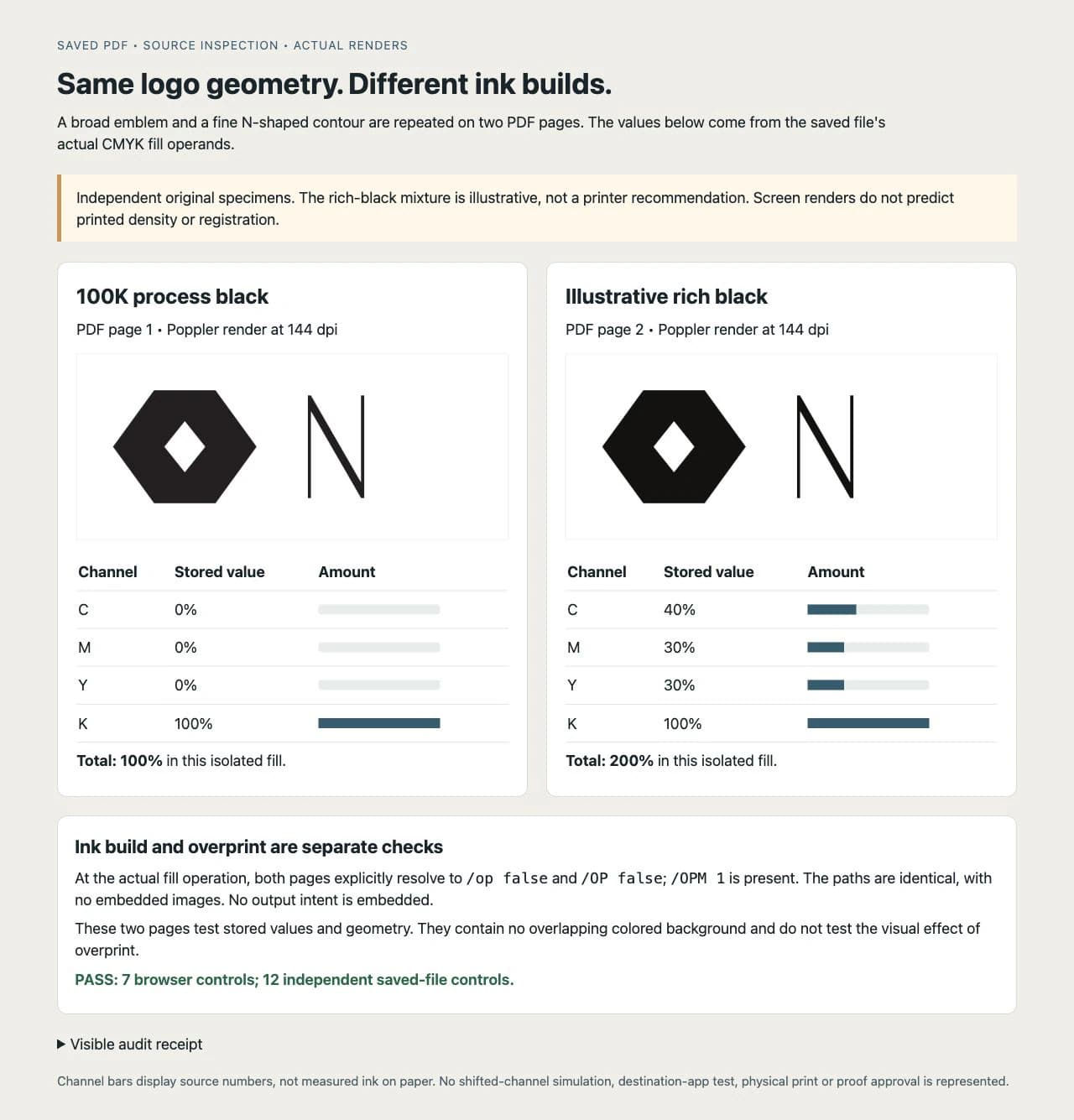
We reopened the saved PDF with pypdf and inspected its content operations and graphics-state resources. Twelve controls passed: both fill arrays matched the declared values, both pages had identical path commands, the effective fill and stroke overprint flags were explicitly false, and there were no embedded images or output intent. Poppler rendered both pages at 144 dpi into 840 × 360-pixel images, which are shown above.
The file inspection establishes what these specimens store. The screen renders show one renderer's composite, without a specified production output condition. They do not establish printed darkness, neutral color, drying behavior, registration tolerance, or acceptance by a printer. We did not run an Illustrator, InDesign, or Acrobat workflow, print either specimen, or generate production RIP separations.
Keep overprint separate from the black mixture
An object's ink build tells you its color components. Overprint determines whether underlying ink is retained when that object overlaps other artwork. The same 100K fill can occur in files with different overprint settings.
Our specimens deliberately set both fill and stroke overprint to false. They also contain overprint mode 1, recorded separately as /OPM 1; that value does not make a false overprint flag true. There is no colored background underneath the specimen, so this test does not demonstrate an overlap's visual result.
In a real layout, application preferences, object attributes, and output handling need attention. Adobe documents automatic overprinting of its 100% black swatch in InDesign, with preferences and exceptions. Do not infer the exported setting from the word "black" or transfer that application's default to every file. Use the overprint versus knockout guide when deciding which underlying ink regions should remain.
This distinction also matters when someone asks to "make all blacks richer." A broad field, a fine wordmark, and a barcode should not be changed together without reviewing their different roles. Keep an untouched master and make targeted changes in a delivery copy.
Inspect your exported file before sending it
Start with the actual file you intend to deliver, not a screenshot or the editable source alone. Get the printer's accepted format, color setup, black-build instructions, and ink-coverage limit. Record which details should remain 100K and which objects may use its rich-black mixture.
For a PDF workflow, Adobe documents Output Preview's separations, ink-coverage readings, color warnings, and Object Inspector. The following is a documented inspection route, not an Acrobat session we tested for this article. Have prepress perform it if you do not have an appropriate tool.
- Open the exported PDF in the recipient's prepress tool. Confirm the intended output condition before judging simulated appearance.
- Sample the fine wordmark and the broad field separately. Compare each object's C, M, Y, and K values with the agreed specification.
- Inspect individual process plates. A detail intended to be 100K should not acquire C, M, or Y merely because it looks black in the composite. Investigate a mismatch in the source object's fill or color-conversion settings.
- Inspect overlaps separately. Underlying color retained by intentional overprint is a different cause from an accidentally rich object fill. Use object information and overprint simulation together.
- Check total ink coverage against the printer's stated limit, and review any registration color inside artwork. Avoid using a generic number from this example as the limit.
- Run the printer's requested preflight inspection and retain its report. Adobe's Preflight documentation describes profile-based checks for color, ink coverage, and other PDF properties. Choose analysis without automatic fixes while diagnosing; some profiles can also alter the file.
If values or plate assignments disagree with the specification, correct the delivery copy, export a new file, and inspect that new export. A successful check on an earlier PDF does not cover a later replacement.
You have completed the file check when the intended fine details have the agreed ink assignment, broad fields use the agreed build, overprint is deliberate, and the requested preflight has no unresolved relevant findings. Printed appearance still needs the supplier's agreed proof. Adobe notes that monitor separation preview does not verify trapping or halftone screen settings, among other output details.
Recover missing shapes before choosing production ink
If a suitable flat logo survives only as a PNG or JPG, PerfectVector can help rebuild its visible artwork as editable vector paths. Compare the silhouette, thin contours, lettering, and small openings with the source before using that geometry in the production document. The logo vectorization workflow is useful for that recovery step.
Vectorization does not recover an original brand's approved CMYK mixture, spot ink, overprint decision, or press profile. A traced black-looking fill still needs the printer's color setup. If exact brand geometry or lettering cannot be recovered from the pixels, obtain the original master or have the mark redrawn. Soft photographic tone and texture can remain raster when the production workflow calls for them.
FAQ
Should a black logo use rich black or 100K? Discuss 100K for fine lettering and thin contours, and the printer's specified rich black for broad areas where appropriate. Review each element at its intended printed size. The printer's process, stock, detail requirements, and proof determine the final setup.
Is RGB black the same as 100K black? No. An RGB black value does not specify CMYK percentages. Inspect the actual exported object's color components and the production output settings rather than assuming a black screen preview means 0C/0M/0Y/100K.
Is there one correct rich-black formula? No. Get the mixture from the print provider for the particular process and stock. The 40C/30M/30Y/100K values in this article are an illustrative PDF control, not a production recommendation.
Does 100K automatically mean overprint? No. Ink build and overprint are separate properties. Some applications apply black-overprint preferences, but the actual exported object and output workflow still need inspection. Our 100K specimen explicitly has fill overprint set to false.
Sources
- Mixam — Standard Black vs Rich Black — Supports its advice for fine detail and explains the separate role of registration black.
- Adobe — About overprinting in InDesign — Distinguishes rich black from process black and registration color, requests supplier-specific percentages, and documents black-overprint preferences.
- Adobe — Preview output in Acrobat Pro — Documents separation, ink-coverage, overprint, and object inspection features and the limits of monitor preview.
- Adobe — Analyzing documents with the Preflight tool — Explains profile-based inspection and the distinction between analyzing and applying corrections.
If your logo exists only as pixels, recover editable logo paths with PerfectVector, compare the fine details with the original, and apply the printer's ink specifications in the production copy before approving its proof.
More from the blog

Trapping vs Bleed: Check the Right Print Boundary
Locate a white edge before changing print artwork. Compare internal ink overlaps with outer bleed, inspect an original digital model, and brief prepress.

Double-Sided Game Tokens: Match Front and Back
Match the fronts and backs of game tokens with a numbered sheet example. Check long-edge and short-edge layouts, readable symbols, and a separate paper proof.